Your Professional Advertising Luminous Sign customizer
Fllow us:

Leave Your Message
-
E-mail
-
Phone
-
Whatsapp


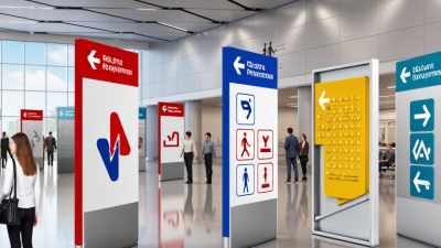
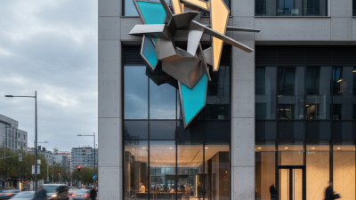
For global brands, Design Signage is more than a logo placed above a doorway. It is a public promise made in physical space. A traveler may see it in an airport, a shopper may follow it through a crowded mall, or a customer may search for it through rain-streaked glass. Clear signage reduces hesitation and makes unfamiliar places feel easier to understand.
David Gibson, author of The Wayfinding Handbook, explains, “Wayfinding is the process of using spatial and environmental information to navigate to a destination.” His observation shows why strong Design Signage must guide people, not merely decorate walls. Effective systems connect brand identity with practical decisions. Typography should remain readable from a distance. Color contrast should survive bright sunlight and dim interiors. Symbols should support different languages without creating confusion. Materials must also withstand frequent touching, cleaning, weather, and time.
Small details matter.
A consistent sign family can make a store recognizable in Tokyo, Toronto, or São Paulo. However, global consistency should not erase local meaning. A color, icon, or phrase may feel welcoming in one market and confusing in another. Experienced teams test signs in real conditions, observe customer movement, and revise what fails. That process is not always perfect. Some brands protect visual rules so tightly that people struggle to find the entrance. Others add too much information and weaken the message.
The strongest Design Signage balances recognition with immediate understanding. It respects cultural context, accessibility, and human behavior. More importantly, it treats every sign as part of the customer experience, not as a final graphic detail.

Design signage is a practical language for global brands. It communicates before staff speak, especially in airports, malls, hotels, and unfamiliar streets. What design signage means for global brands is more than attractive lettering. It creates recognition, reduces hesitation, and guides people through physical spaces.
CSA Research reported that 76% of consumers prefer product information in their own language, while 40% will not buy when information is presented only in another language. Signage must therefore support local languages without losing visual consistency. Clear icons, readable type, and controlled color contrast help visitors act quickly. The World Health Organization estimates that 1.3 billion people experience significant disability. Accessible signage is not a decorative choice. It includes tactile characters, braille, suitable contrast, and placement within comfortable viewing ranges.
Experience shows that small details often decide whether a space feels trustworthy. A poorly translated direction sign can create doubt. A reflective surface can make important text unreadable. Even familiar symbols may carry different meanings across cultures. A perfect global system is unrealistic. Local testing is still necessary. Design teams should observe real users, measure wayfinding errors, and revise signs after installation. The Society for Experiential Graphic Design also emphasizes research, usability, and environmental context in effective signage practice. A sign should remain recognizable from a distance, understandable under pressure, and respectful of the people using it.
| Design Dimension | Relevant Metric or Standard | Verified Requirement | Meaning for Global Brand Environments |
|---|---|---|---|
| Visual Contrast | WCAG 2.2 contrast ratio | A minimum contrast ratio of 4.5:1 is required for normal-sized text, while 3:1 is required for large text under WCAG 2.2 Level AA. | Improves readability across different lighting conditions, viewing distances, and user abilities. |
| Safety Communication | ISO 7010 | ISO 7010 specifies standardized safety signs for accident prevention, fire protection, health hazards, and emergency evacuation. | Reduces dependence on written language when people need to identify hazards or emergency routes quickly. |
| Public Information Symbols | ISO 7001 | ISO 7001 defines standardized graphical symbols for public information, including facilities, services, and wayfinding contexts. | Creates a more consistent visual language for visitors from different linguistic backgrounds. |
| Multilingual Content | Language and script coverage | Translated signage should be reviewed for local terminology, writing direction, character rendering, line breaks, and cultural interpretation before production. | Prevents translation errors, awkward text expansion, and incorrect interpretation in international locations. |
| Wayfinding Efficiency | Information hierarchy | Directional signs should present the destination, direction, and supporting information in a clear and consistent order. | Helps users make faster navigation decisions in airports, campuses, retail spaces, offices, and public facilities. |
| Typography | Legibility factors | Typeface selection, letter spacing, character height, viewing distance, illumination, and surface finish should be evaluated together rather than treated as isolated choices. | Maintains legibility across different locations, sign sizes, languages, and installation conditions. |
| Accessibility | Universal design principles | Signage should combine readable text, strong contrast, recognizable symbols, tactile information where required, and appropriate placement for the intended users. | Supports people with visual, cognitive, mobility, and language-related access needs. |
| Color Management | Color meaning and reproduction | Color should not be the only method used to communicate meaning, and production specifications should account for differences between digital, printed, painted, and illuminated surfaces. | Protects recognition and consistency when signage is reproduced in different countries and materials. |
| Environmental Durability | Material and installation performance | Outdoor signage should be specified according to exposure to ultraviolet radiation, moisture, temperature changes, wind, impact, and cleaning requirements. | Preserves the intended appearance and information quality throughout different climates and operating environments. |
| System Consistency | Design-system governance | A signage system should define common rules for symbols, colors, typography, spacing, mounting height, arrows, naming, and local adaptations. | Allows international locations to remain recognizable while still meeting local legal, linguistic, and cultural requirements. |