Your Professional Advertising Luminous Sign customizer
Fllow us:

  • shabang01
  • shabang02
  • shabang03
  • shabang04
Leave Your Message

How to Design Signage for Global Markets?

Design Signage for global markets requires more than translating words. A clear sign must work across languages, cultures, scripts, and physical environments. A red symbol may suggest urgency in one region but celebration in another. Even familiar icons can carry unexpected meanings.

Experienced teams begin with the setting. They study viewing distance, lighting, weather, traffic flow, and local reading habits. A crowded airport needs fast recognition. A quiet museum may support more detailed information. Typography must remain legible in Latin, Arabic, Cyrillic, or Asian writing systems. Translation should be reviewed by native speakers, not handled through software alone.

Small details matter.

Reliable signage also respects accessibility and local requirements. Contrast, font size, tactile elements, and placement can affect whether people navigate independently. Designers should confirm applicable standards with qualified local professionals. They should also test physical prototypes, because a screen preview cannot reveal glare, shadows, or confusing sightlines.

There is no universal template. That is the difficult part. A design that succeeds in London may feel cold, unclear, or culturally misplaced in Seoul or São Paulo. Even experienced designers can overlook regional humor, hierarchy, or indirect communication styles. Honest review is necessary.

This guide explores practical methods for creating signage that feels clear, respectful, and trustworthy across markets. It connects design research with local expertise, user testing, and careful production. The goal is not perfect uniformity. It is consistent understanding, wherever the sign appears.
How to Design Signage for Global Markets?

Define the Purpose and Audience of Global Signage

Global signage should begin with one question: what must people do, understand, or avoid? Purpose comes first. A wayfinding sign reduces uncertainty at a crowded airport. A safety sign demands immediate recognition. These goals require different wording, symbols, contrast, and placement. Before translating, document the action, location, viewing distance, lighting, and available reading time. In signage reviews, teams often start with attractive layouts. That is a costly detour. A sign can look polished and still fail its audience.

Audience definition must be specific, not simply “international visitors.” Identify languages, reading abilities, age groups, cultural expectations, and mobility needs. CSA Research reported in its 2020 study that 76% of online shoppers prefer information in their own language, while 40% will not buy in another language. Although this research concerns digital commerce, it highlights a wider principle: language affects trust and action. The World Health Organization estimates that 1.3 billion people, or 16% of the global population, experience significant disability. Accessibility is not a narrow requirement. Test translations with native speakers and local users. Do not rely on literal conversion. A short phrase may expand dramatically in German or Arabic. Allow space.

ISO 3864 and ISO 7001 provide useful references for safety colors and public information symbols. They do not replace field testing. Measure whether people notice the sign, understand it, and act correctly within seconds. Record mistakes. They reveal more than compliments. Test with older adults, travelers carrying luggage, and people using mobility aids. One uncomfortable finding may be that the sign serves staff better than visitors. Revise the purpose, audience, or both.

Research Cultural, Linguistic, and Legal Requirements

How to Design Signage for Global Markets?

Effective international signage begins with local research, not direct translation. Colors, gestures, numbers, and symbols can carry different meanings across cultures. A white background may suggest cleanliness in one region and mourning in another. Directional arrows should also be tested, especially in places using right-to-left scripts. Small details matter.

Linguistic accuracy requires more than replacing words. Work with qualified native-language reviewers who understand local dialects and public terminology. Check line breaks, accents, reading order, and text expansion before production. A short English instruction may become much longer in another language. Leave enough space. Avoid idioms, humor, and unclear abbreviations. A grammatically correct translation can still sound unnatural.

Legal review protects both users and operators. Confirm local rules for permits, sign placement, accessibility, contrast, lighting, emergency wording, and language priority. Requirements can differ between cities, buildings, and transport areas. Consult local authorities or legal professionals before installation. Test the sign with people from the intended audience, including older users and people with visual limitations. No checklist catches everything. I would also revisit the design after real-world observation, because a sign that looks clear on a screen may fail beside glare, crowds, or unfamiliar architecture.

Build a Clear and Inclusive Signage System

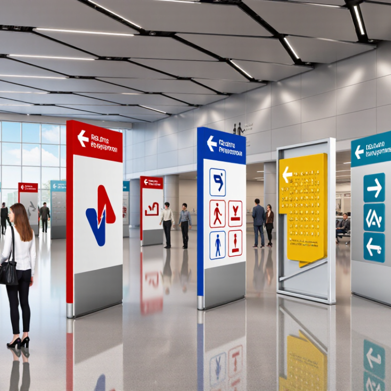
Designing signage for global markets starts with a system, not a collection of attractive signs. A clear system uses consistent symbols, spacing, color contrast, and reading order across locations. Keep it calm. Visitors should understand the message before noticing the decoration. Use plain language, then support it with familiar icons. Do not assume one symbol carries the same meaning everywhere. Our first draft relied too heavily on text, and crowded entrances exposed the mistake. A shorter phrase and a generous line break worked better.

Inclusive signage considers vision, language, mobility, age, and stress. Place signs at eye level, but check visibility from a wheelchair and a moving queue. Use high contrast without depending on color alone. Pair a colored route with a shape, arrow, or written label. Offer translations where audiences need them, while keeping the primary message easy to scan. Avoid idioms, slang, and unexplained abbreviations. A restroom sign, emergency direction, or floor marker should remain recognizable under poor lighting. Test printed samples in daylight, shadows, and glare.

Reliable systems come from observation and revision. Watch people use the signs without guiding them. Record hesitation, wrong turns, and questions. Then adjust the wording, size, or placement. Local reviewers can identify cultural details that remote teams overlook. Still, consultation cannot replace measured usability testing. One weakness remains: no system fits every site perfectly. Build flexible rules, document exceptions, and review them after installation. That discipline protects clarity as languages, buildings, and visitor needs change.

How to Design Signage for Global Markets? - Build a Clear and Inclusive Signage System

Design Dimension Verified Requirement or Data Point Global Application Implementation Guidance
Language Coverage Identify the official, commonly used, and legally required languages for each destination market before producing artwork. All markets, especially multilingual cities, transport hubs, healthcare facilities, and public services. Use a translation glossary, native-language review, and a content hierarchy that remains clear when text expands.
Writing Direction Latin, Cyrillic, Greek, Arabic, Hebrew, and many Indic scripts require different character shapes, spacing, and layout considerations. Arabic and Hebrew are written right to left. Markets using right-to-left or complex-script languages. Create mirrored layout rules where appropriate, but do not mirror internationally recognized symbols unless the relevant standard requires it.
Pictograms ISO 7001 defines graphical symbols for public information, while ISO 7010 defines graphical symbols for safety signs. Public information, wayfinding, emergency, prohibition, warning, and mandatory-action signage. Use standardized symbols where applicable and validate local legal requirements before substituting custom icons.
Color and Contrast Do not rely on color alone to communicate meaning. For digital signage content, WCAG 2.2 recommends a minimum contrast ratio of 4.5:1 for normal text and 3:1 for large text. Physical signs with varied lighting and digital displays used in public environments. Combine color with text, shape, position, or symbols, and test signs in bright, dim, reflective, and low-vision conditions.
Typography Legibility depends on viewing distance, letter height, stroke width, typeface, illumination, and contrast rather than font size alone. All wayfinding, identification, directional, and safety signs. Use a tested typeface with complete script coverage, adequate spacing, and a clear hierarchy. Avoid condensed or decorative styles for essential instructions.
Tactile and Braille Access The United States ADA Standards specify raised tactile characters, including uppercase sans-serif forms, and Grade 2 Braille for covered facilities; local accessibility rules may differ. Accessible facilities, room identification, elevators, exits, and public buildings subject to accessibility legislation. Separate tactile and Braille production requirements from printed artwork and verify mounting height, placement, and local regulations.
Localization and Text Expansion Translated text can become substantially longer or shorter than the source text, depending on the language and terminology. Multilingual signs, digital displays, temporary notices, and emergency instructions. Reserve flexible space, avoid text embedded in images, and approve translations in the final sign context rather than in isolation.
Cultural Interpretation Gestures, colors, numbers, animals, and imagery can carry different meanings across cultures. Retail, hospitality, healthcare, education, government, and international transit environments. Prefer neutral, action-oriented symbols and conduct in-market review with local users before launch.
Wayfinding Sequence A wayfinding system should provide consistent confirmation, directional, decision-point, and destination information. Large sites, campuses, hospitals, airports, stations, event venues, and public complexes. Assign unique identifiers to destinations and repeat the same wording, symbols, colors, and directional logic throughout the journey.
Testing and Governance Accessibility obligations, fire-safety rules, building codes, and language requirements vary by jurisdiction and can change over time. Every target market and every regulated sign category. Maintain a version-controlled signage standard, document approvals, test prototypes with representative users, and obtain local compliance review before installation.

Reference framework: ISO 7001 public information symbols, ISO 7010 safety signs, WCAG 2.2 contrast guidance for digital content, and applicable local accessibility and building regulations.

Adapt Visual Designs for Regional Markets

Designing signage for global markets requires more than translating words. A visual cue can feel friendly in one region and confusing in another. Start with local observation: photograph streets, note viewing distances, and ask residents what they notice first. Keep it practical. Scripts may need different spacing, line heights, or reading directions. A translated phrase can also become much longer.

Color and symbols deserve careful testing. White may suggest cleanliness in one culture but mourning in another. Hand gestures, animals, and arrows can carry unexpected meanings. Use high contrast, familiar icons, and clear type at a distance.

I once approved a layout that looked balanced in English, yet the local version felt crowded. The mistake was mine. I had protected the grid instead of the reader.

Regional adaptation should include small field trials before full production. Place a printed mock-up near the real entrance, then observe people approaching from different angles. Ask whether they can understand it without assistance. Check glare, night visibility, weather, and accessibility needs. Local reviewers should assess language, imagery, tone, and relevant requirements. Their feedback is not decoration. It is evidence. Still, consensus can hide useful disagreement, so record opposing views and test both options. Leave room for revision. Good signage evolves through use, not confidence alone.

Test, Localize, and Maintain Signage Worldwide

How to Design Signage for Global Markets?

Effective global signage begins with testing, not translation. Place full-size mock-ups in realistic locations, including entrances, corridors, parking areas, and low-light spaces. Measure whether people can read the message from the intended distance. Test colors, contrast, icons, and type sizes with people of different ages and abilities. Ask local reviewers to explain what each sign means. Their answers may expose confusing symbols or unintended meanings. Small errors become expensive when repeated across hundreds of locations.

Localization requires more than replacing words. Work with qualified native-language specialists who understand regional expressions, reading directions, measurement units, and cultural expectations. Check whether the layout expands after translation. A short English instruction may require two lines in another language. Leave enough space for this change. Images also need review. A gesture, color, or symbol may feel neutral to one audience and inappropriate to another. Some drafts will fail. That is useful evidence, not wasted effort.

Signage must remain accurate after installation. Create a simple inventory with location, language, material, installation date, and replacement history. Inspect signs for fading, glare, peeling edges, and blocked sightlines. Train local staff to report unclear or damaged signage with photographs. Keep approved files and revision notes in one controlled system. Review signage after renovations, policy changes, or customer feedback. I have found that maintenance is often planned too late. A beautiful sign becomes unreliable when nobody owns its next review.