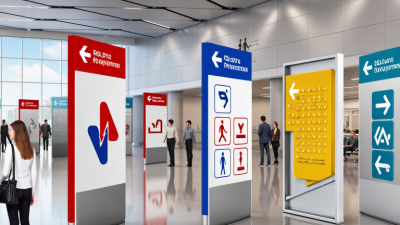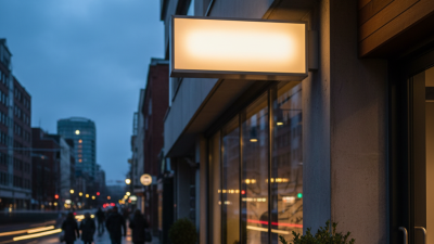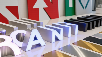

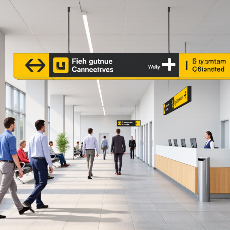
A sign has only a few seconds to earn attention. One reported retail finding says 68% of consumers purchased after a sign caught their eye. That figure makes visibility a business measure, not just a design preference. Still, attention alone does not prove a sign caused the sale. Track results with a clear baseline, such as weekly sales before and after installation.
Design for the real viewing distance. A headline should be readable from the doorway, not only up close. Use strong contrast, generous spacing, and one clear message. For example, a café window sign might pair “Fresh soup today” with a simple price and a small bowl illustration. Keep it legible. Avoid filling every corner with offers, logos, and decorative details.
Measure what people do. Record foot traffic, sales of the promoted item, and the sign’s location and display dates. If possible, compare similar periods or test two versions in comparable areas. Weather, staffing, and seasonal demand can distort the result. Even a neat test can be imperfect. Note those limitations, then revise one element at a time: wording, color, placement, or size. A sign that looks attractive on a screen may disappear under window glare, so check it in daylight and after dark.