How to Choose Custom Signs for Your Business?
Choosing Custom Signs is not just a matter of picking a color and adding your logo. The right sign helps customers find your business, understand what you offer, and recognize your brand from the sidewalk. A useful reminder comes from graphic designer Paul Rand, often credited with saying, “Design is the silent ambassador of your brand.” For a storefront sign, that ambassador may have only a few seconds to make an impression.
This guide will help you connect your sign choice to real business needs. Consider where people will see it: a sunlit road, a narrow hallway, or a busy shop window. Then compare materials, lettering, colors, lighting, and installation requirements. A small café might need clear hours on its door and readable lettering above the entrance. A warehouse may need bold directional signs that visitors can spot from across a large lot. Details matter.
Budget matters, too. But the cheapest option can become costly if letters fade or customers struggle to read them. And there is no perfect formula. I would not pretend every business can predict exactly what people notice first. Gather feedback, check the design at a distance, and revise when something feels unclear. A second opinion helps. The sections ahead will cover sign types, design choices, materials, costs, and questions to ask before placing an order.
Define Your Business Goals and Signage Requirements
Define the job before choosing a sign. Is it meant to help drivers spot your entrance, guide visitors to reception, or explain a service from the pavement? Write down the audience, viewing distance, location, and one action you want people to take. A 2012 U.S. consumer signage survey of 1,000 adults found that 76% had entered a store they had never visited because of its sign. That figure makes visibility worth testing, not merely assuming. A sign that looks clear on a screen may disappear beside a busy road.
Turn the goal into practical requirements. Note the available wall or window space, lighting, likely weather exposure, and viewing angle. Set a readable type size and keep the message brief; a passerby may have only seconds. For indoor signs, map the route from entrance to service desk and mark every decision point. Sketches help. They can also mislead. Check a full-size paper mock-up from the actual viewing distance, then ask someone unfamiliar with the business what they notice first. Record material and maintenance needs, too: a sun-facing panel may fade, while a glossy finish can reflect evening lights. Requirements change with the site, and a second measurement is rarely wasted.
Choose Sign Letter Height for Viewing Distance
When defining signage requirements, estimate how far away people will view the sign. This chart applies a common planning rule of thumb of about 1 inch of letter height per 10 feet of viewing distance. Actual readability depends on factors such as font, contrast, lighting, and viewing conditions; check applicable local requirements before ordering.
Identify Suitable Sign Types and Locations
Choosing a sign starts with a task: help people find you, understand your offer, or enter safely. Match the format to the viewing distance. A wall sign can identify a storefront, while a window graphic can share hours or a focused promotion. Directional signs work best at decision points, such as a parking entrance or hallway turn. Distance matters.
Location can matter as much as design. Walk the customer’s route and note where trees, parked cars, glare, or other signs block the view. Check visibility from both directions, including at night if customers arrive after dark. A sign that looks clear on a screen may disappear against a busy street.
Test it from the sidewalk.
The Sign Research Foundation’s report, The Economic Value of On-Premise Signs, found that 60% of surveyed businesses reported sales increases after adding or updating signs; reported gains averaged about 10%. That is useful context, not a promise for every business. Choose a sign based on its job, then assess the actual site before ordering. Measure sightlines, photograph the approach, and ask someone unfamiliar with the location to find the entrance. Their hesitation can reveal a flaw you missed. I’d revisit that choice.
Choose Materials, Sizes, and Visual Design
A custom sign should fit its surroundings and help people act quickly.
Note where customers will see it: from a passing car, across a lobby, or beside a doorway. Measure the available space before choosing a size. A sign that looks balanced on a screen may feel cramped on a narrow wall. Check viewing distance, too.
Material affects appearance, upkeep, and readability.
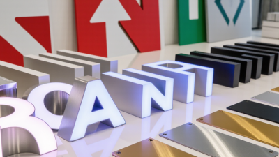
Aluminum suits many outdoor settings because it resists rust, while acrylic can give indoor signs a clean, polished look. Wood adds warmth, but its finish may need more care outdoors. Ask how the sign will handle sun, rain, cleaning, and temperature changes. Small details matter.
Keep the visual design easy to scan.
Use strong contrast, clear lettering, and only the information people need at that spot. A street-facing sign may need larger text than a directory viewed up close. I still find scale easy to misjudge; a paper mock-up taped to the wall can reveal awkward spacing. Check it from several angles and under the actual lighting. Perfect symmetry is not always the most readable choice.
Check Regulations, Accessibility, and Durability
Before ordering a custom sign, check local planning rules, landlord requirements, and permits. Rules can govern size, lighting, placement, and materials. Requirements vary by location, so confirm them with the relevant authority before production. A compliant design can still disappoint if it is hard to read from the sidewalk.
Accessibility deserves equal attention. Where applicable, the ADA Standards specify features such as raised characters and Braille for certain signs; local requirements may differ. The CDC reports that about one in four U.S. adults has a disability, making clear, legible wayfinding important to many customers. Contrast, glare, letter size, and viewing distance all matter. Small details matter. FedEx Office’s 2012 survey found that 76% of consumers had entered a store they had not visited before because of its sign. A sign should attract attention without sacrificing readability.
Tips: Ask for a full-size proof and inspect it from across the street, not just on a screen. Choose finishes suited to local sun, rain, wind, or coastal salt. Ask the fabricator about maintenance and expected service life. A glossy sample may look vivid indoors but create glare outside. It is easy to overlook that. Check the installation plan, too, and keep a copy of approvals and material specifications.
Compare Costs, Vendors, and Installation Options
Price the complete project, not just the sign. Ask vendors to itemize design, materials, fabrication, delivery, mounting hardware, electrical work, lift rental, and maintenance. Sign Research Foundation’s 2012 report, The Economic Value of On-Premise Signs, found that 60% of surveyed businesses reported sales increases after adding or updating signs. Treat that as useful context, not a promise: location, visibility, and foot traffic all affect results. Compare like with like.
Request drawings, material specifications, warranties, and a clear installation schedule from each vendor. A low quote may exclude wall repairs, wiring, or equipment needed to reach a high façade. For illuminated signs, ask for estimated wattage and operating hours, then check local electricity rates. The U.S. Energy Information Administration publishes commercial electricity data by state, which can help estimate running costs. Keep it practical.
Choose installation based on the building and sign type. Window graphics may need little more than careful surface preparation; projecting signs can require structural checks and powered installation. Ask who handles site measurements, access equipment, and cleanup, and get those responsibilities in writing. A payback estimate can look precise while relying on guessed sales lift. Mine would. Leave room for uncertainty, especially when comparing a simple panel with a lit, custom-built sign.