Outdoor Signs work before a customer enters the door. They identify a business, guide visitors, and shape expectations from the street. In 2026, choosing the right format means balancing visibility, readability, durability, and brand fit—not simply choosing the brightest option. First impressions matter.
Design expert Paul Rand captured the branding principle well: “Design is the silent ambassador of your brand.” That idea applies directly to signs seen on a storefront, roadside, or building façade. Crisp channel letters can make a storefront easier to spot after dusk. Monument signs suit low-rise properties near busy roads, while well-positioned blade signs can help pedestrians find a shop on a crowded block. Digital displays offer changing messages, but they need thoughtful content and regular attention. More features do not always mean more impact.
This guide compares popular outdoor sign types for different business settings and explains what to consider before investing. We’ll look at materials, lighting, placement, maintenance, and legibility from a driver’s or pedestrian’s viewpoint. A sign that looks impressive on a screen may feel cramped above a real doorway. That can backfire. The strongest choice is usually the one customers can read quickly and the business can maintain consistently. We’ll also consider how weather, nearby visual clutter, and changing brand needs affect performance. No format is perfect; even a durable sign can be overlooked if its message is unclear.
Outdoor business signs are signs placed outside a business to identify its location, share key information, and guide visitors. Common options include storefront signs, sidewalk boards, window graphics, and illuminated signs. Each serves a different purpose. A clear storefront sign helps people spot an entrance from across the street, while a sidewalk board can catch the attention of pedestrians passing nearby. Readable lettering, strong contrast, and a suitable size make a message easier to notice. Keep it simple.
Effective signs attract customers by answering quick questions: What is this place? What does it offer? Is it open? A café might display its name and a small menu near the door; a clinic may prioritize its entrance and hours. Visibility matters, but so does context. A sign partly hidden by a tree or crowded with text may go unnoticed. Even a polished sign cannot guarantee more visits, so review foot traffic and customer feedback before changing it.
Tips: View your sign from the sidewalk and across the street. Check readability in daylight and after dark. Replace faded or damaged materials promptly, and avoid squeezing too many details into one message.
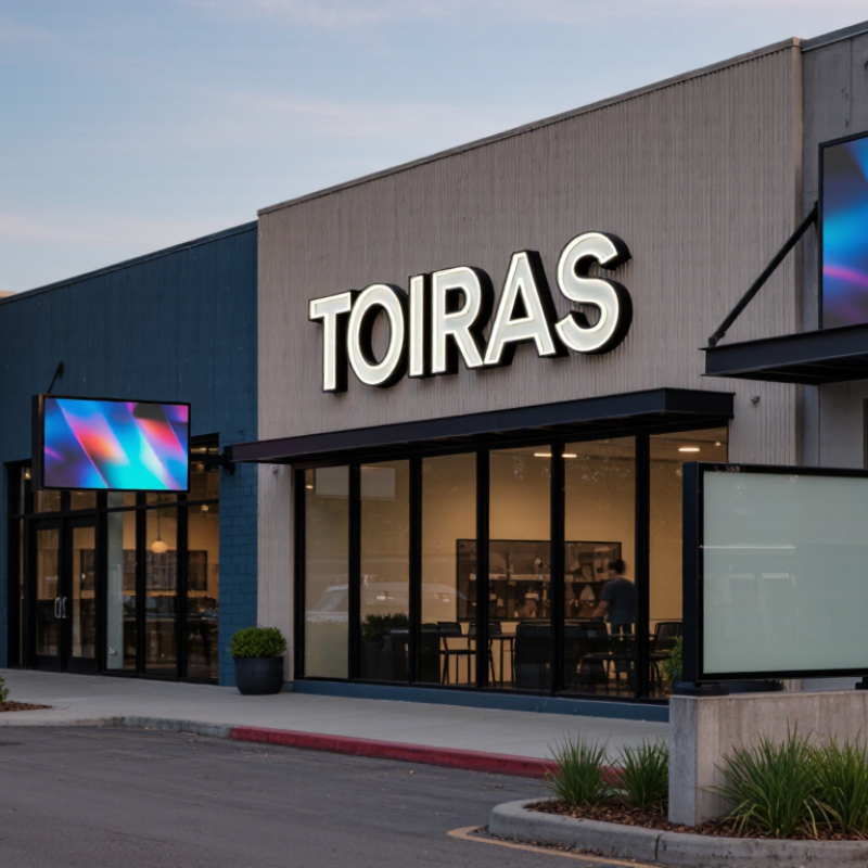
Outdoor signs give customers their first clue about a business and where to enter. Storefront signs, including flat fascia panels and raised letters, identify shops along busy streets. Illuminated lettering can help after dusk, while non-lit signs may suit businesses with daytime hours. Keep wording short and readable from the sidewalk or road. Small details matter: glare, shadows, and a tree branch can hide an otherwise well-designed sign.
Monument signs sit low near entrances and work well for offices, clinics, and businesses set back from the road. Taller pole signs can be easier to spot from a distance, but their size should fit the site rather than overwhelm it. For pedestrians, projecting blade signs face people walking along the block. A-frame signs can point toward a café or open house. They need daily attention. Wind can move them, and they may block a clear walking path if placed carelessly.
Window graphics can display hours, services, or a simple promotion without adding another structure. Banners are flexible for temporary events, though their edges may look worn after repeated exposure to rain and sun. Choose durable materials suited to local weather, and check that colors remain legible against the building. No sign type fits every location; viewing distance, lighting, foot traffic, and maintenance needs all affect the choice. A sign that looks striking in a mock-up may feel crowded on the actual storefront.
Outdoor signs serve different purposes, and visibility depends on distance, traffic speed, and what blocks the view. A monument sign near an entrance can be spotted by drivers approaching from the road. Its larger face suits business names, hours, or several tenant listings. It may be less useful when trees, parked vehicles, or a sharp turn hide it.
Building-mounted signs keep a business identifiable once visitors reach the property. Raised letters can stand out against brick or glass, but a sign facing the wrong direction may be nearly invisible from the street. Placement changes everything. Window graphics work closer up, sharing opening hours or services with pedestrians. They can look crowded, though, if too much information competes with reflections and indoor displays.
A-frame signs catch attention on sidewalks and near entrances, especially when they offer one clear message. They are not a substitute for signs visible from farther away. Small signs still matter. Directional signs help visitors find parking, entrances, or separate suites after arriving. A practical choice is to match each sign to the moment people need it; honestly, that planning is easy to overlook. Check sightlines from a driver’s approach and a pedestrian’s eye level before deciding where each sign belongs.
| Outdoor Sign Type | Visibility | Primary Purpose | Best Viewing Context | Key Strength | Main Consideration |
|---|---|---|---|---|---|
| Pylon or Pole Sign | High — elevated and visible from a distance | Identify a business or group of businesses and guide drivers to a site | Roadside locations, shopping centers, and sites set back from the road | Height can help the sign stand out above nearby vehicles and landscaping | Requires suitable space, structural support, and compliance with local sign and zoning rules |
| Monument Sign | Medium to high — prominent near the entrance | Mark a property, campus, or business entrance | Roadside approaches and pedestrian or vehicle entrances | Provides a substantial, ground-level identification point | Usually less visible from far away than an elevated sign; landscaping and sightlines matter |
| Illuminated Channel Letters | High — especially after dark | Display a business name or short message on a building facade | Storefronts, building fronts, and commercial streets | Individual dimensional letters can be easy to read and may be internally illuminated | Readability depends on letter size, contrast, viewing angle, and surrounding light |
| Illuminated Cabinet Sign | High — visible in low-light conditions when illuminated | Show a logo, name, or concise message in a single sign panel | Building facades, canopies, and freestanding sign structures | Offers a broad, illuminated display area | Panel design and lighting should preserve contrast and legibility; electrical installation may be needed |
| Digital LED Sign | High — attention-getting when content is clear and appropriately lit | Share changing messages, schedules, promotions, or announcements | Locations where viewers have enough time to read a brief message | Content can be updated without replacing a printed panel | Brightness, message length, animation, and placement should suit the setting and local regulations |
| A-Frame or Sidewalk Sign | Medium — effective at close range | Attract nearby pedestrians and communicate a daily offer or direction | Sidewalks, storefront approaches, and pedestrian-heavy areas | Portable and practical for short, changeable messages | Must not obstruct accessible routes or public rights-of-way; wind and weather can affect placement |
| Window Graphics | Medium — strongest for people near the storefront | Display hours, services, offers, or visual branding on glass | Storefront windows and pedestrian-facing entrances | Uses existing window space and can communicate information at eye level | Excessive coverage can reduce interior daylight or visibility into the business |
| Outdoor Banner | Medium — varies with size, placement, and viewing distance | Announce a temporary event, sale, opening, or seasonal message | Fences, building exteriors, and permitted event locations | Lightweight and suitable for temporary campaigns | Secure mounting is important; wind exposure, material, and local display rules should be considered |
| Vehicle Graphics | Variable — depends on vehicle activity and exposure | Identify a business or service vehicle and extend brand awareness on the road | Vehicles in transit, at job sites, and in parking areas | Can carry a business name and contact information across multiple locations | Keep copy concise and legible; visibility changes with traffic, vehicle position, and time on the road |
Note: Visibility ratings are comparative, not guaranteed. Actual performance depends on sign size, contrast, lighting, viewing angle, traffic speed, surroundings, installation, and local regulations.
Choosing an outdoor sign starts with its job. A storefront sign should help people spot your entrance, while a roadside sign needs to communicate quickly from farther away. Stand where customers will approach and note the viewing distance, traffic speed, and sightlines. Then choose lettering large enough to read without stopping. Keep the message brief. Small details disappear fast.
Match the material and lighting to the site. A sign facing strong afternoon sun needs clear contrast and finishes that resist fading. In a rainy or coastal location, ask a qualified sign professional about moisture resistance, corrosion, and maintenance needs. For evening visibility, compare illuminated signs with reflective surfaces, considering nearby lighting and operating costs. There is no perfect material. More durable options may cost more upfront, and even a sturdy sign needs occasional cleaning.
Before ordering, check the proposed size and placement against the building, landscaping, and local sign requirements. A simple paper mock-up can reveal problems: tape it near the entrance, then view it from the sidewalk and parking area. Does the key message stand out? Can visitors find the door? A polished design may still fail if a tree blocks it. I’d also question whether every detail is necessary; businesses often try to say too much. Choose the sign that stays legible, fits its surroundings, and can be maintained realistically.
In 2026, strong outdoor signs include monument signs, illuminated storefront letters, and clear directional panels. The right choice depends on viewing distance and foot traffic. A sign beside a busy road needs fewer words and larger lettering than one near a shop entrance. Use high-contrast colors and a typeface that remains readable in glare. Keep it legible. We can overdesign a sign by trying to fit every service onto it; that trade-off deserves a second look.
Tips: Stand where customers will first see the sign, then check whether its message is clear within a few seconds. Photograph it in daylight and after dark. If important words disappear at either time, adjust the lighting, contrast, or layout. Place directional signs before turns, not after them.
Maintenance affects safety and appearance. Inspect fasteners, supports, wiring, and sign faces regularly, especially after strong winds or heavy rain. Clean off dust and bird residue before they obscure letters. Replace cracked panels and address flickering lights promptly. Keep vegetation trimmed around the sign. For illuminated signs, schedule checks before peak business seasons rather than waiting for a customer to report a dark section. A simple inspection log helps reveal repeat problems, though it can be easy to forget during a busy week. Before installation or changes, confirm local sign and placement requirements.