Top 10 Tips for Creating Custom Signs That Stand Out
Creating effective custom signs is essential for businesses aiming to enhance visibility and attract customers. According to a report by the Sign Research Foundation, about 76% of consumers enter a store based on its signage alone. This statistic highlights the need for impactful designs. Custom signs are not just decorative; they serve as a strategic tool for communication and branding.
Experts agree on the importance of standing out in a crowded marketplace. "A well-designed custom sign can transform the way customers perceive your brand," says John Smith, a leading expert in the custom signage industry. His insights emphasize the role of creativity and clarity in sign design. Poorly designed signs can confuse customers, leading to missed opportunities.
When crafting custom signs, consider both aesthetics and functionality. The right colors, fonts, and materials can make a significant difference. Yet, many overlook the balance between eye-catching design and clear messaging. This oversight can dilute the sign's effectiveness. Thoughtful design is crucial for making a lasting impression and driving customer engagement.

Understanding the Purpose of Your Custom Sign
When creating custom signs, it's crucial to understand their purpose. Signs serve as a visual communication tool that can attract attention and convey information effectively. Research indicates that about 76% of consumers enter a business they have never visited before based on its signage. This statistic emphasizes the need for well-crafted signs that not only inform but engage potential customers.
Not every business owner considers the emotional impact of their signs. Poor design choices can lead to misinterpretation and confusion. For instance, a sign with too much text may overwhelm viewers. The ideal sign should balance visual elements with clear messaging. Designers often recommend using less than ten words on signs to ensure quick comprehension.
Color and font choice also matter significantly. According to a study by the Sign Research Foundation, color can improve brand recognition by 80%. While these numbers are promising, relying solely on trends can lead to uninspired results. A unique approach, rather than copying popular styles, should be prioritized. Personalizing your sign reflects your brand's identity while ensuring it stands out in a competitive market.
Top 10 Tips for Creating Custom Signs That Stand Out
| Tip Number |
Tip Description |
Purpose / Benefit |
| 1 |
Identify the purpose of your sign |
Clarifies the message and target audience |
| 2 |
Choose the right material |
Durability and visual appeal |
| 3 |
Utilize bold colors |
Grabs attention and enhances visibility |
| 4 |
Incorporate clear, readable fonts |
Improves legibility from a distance |
| 5 |
Add graphics or images |
Visual interest and better communication |
| 6 |
Consider the sign's location |
Maximizes exposure to the target audience |
| 7 |
Keep the message concise |
Easier for viewers to understand quickly |
| 8 |
Ensure proper lighting |
Improves visibility day and night |
| 9 |
Use a unique shape |
Differentiates your sign from others |
| 10 |
Test your sign design |
Collect feedback to enhance effectiveness |
Choosing the Right Materials for Durability and Appeal
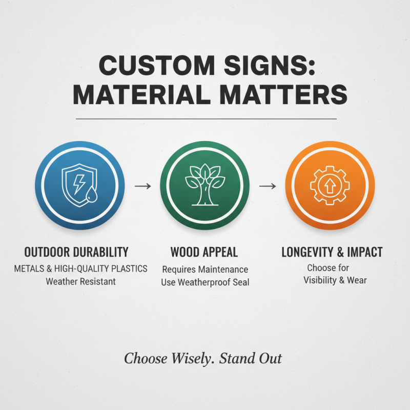
Choosing the right materials is crucial for creating custom signs that stand out. Durable materials can resist weather and wear. For outdoor signs, consider using strong metals or high-quality plastics. These can withstand harsh conditions. Wood can also be appealing but may require more maintenance. A weatherproof seal can help prolong its life.
Think about the aesthetics too. The material affects the overall look. For a modern vibe, acrylic is an excellent choice. Its clarity and color vibrancy capture attention. On the other hand, for a rustic charm, reclaimed wood can be effective, even though it may not last as long. Reflect on your environment and audience.
Keep in mind the cost of materials. Investing in high-quality supplies can seem expensive. However, low-quality options may end up costing more in the long run. You might realize you need to replace signs more often. Take time to experiment with different textures and colors. Sometimes, the unexpected choices lead to the most memorable results.
Incorporating Eye-Catching Design Elements
Creating custom signs that grab attention is an art. It’s essential to incorporate eye-catching design elements. Start with bold colors. Bright hues can attract onlookers quickly. Make sure the colors contrast well for better visibility. A simple design often stands out more than a cluttered one. Use fewer elements but focus on what really matters.
Typography matters greatly. Choose fonts that are legible from a distance. Mixing font styles can create interest, but be cautious. Too many styles can confuse viewers. Additionally, consider using images or graphics. They can reinforce your message without using more words. Strive for balance between text and visuals; it’s a common pitfall to prioritize one over the other.
Don’t forget about the material. Wood, metal, or acrylic can impact the feel of your sign. Experimenting with textures can add depth. You might find that a matte finish works better than gloss in certain conditions. Lastly, remember to test your design with actual viewers. Feedback is vital, as your ideal outcome may differ from theirs.
Selecting Effective Typography and Colors
When creating custom signs, typography plays a crucial role. Choose fonts that are easy to read from a distance. Avoid overly decorative styles; they can confuse the viewer. Bold sans-serif fonts often work best for outdoor signs. They command attention and communicate messages clearly.
Pair a sturdy font with a softer one for contrast. This can create an appealing visual hierarchy.
Color selection is equally important. Use colors that complement your message. Bright colors attract attention, but too many can be overwhelming. Limit your palette to two or three colors. This creates a cohesive look. Think about the emotions colors evoke. For instance, blue is calming, while red is energizing. It’s essential to ensure good contrast between text and background. This enhances legibility and overall impact.
Remember, fewer choices might lead to a more effective design. Sometimes, less truly is more. Take time to step back and critique your design. Ask others for feedback. Reflection can help you identify areas of improvement. Your sign is a reflection of your brand, so make it count.
Ensuring Visibility and Placement for Maximum Impact
When creating custom signs, visibility is crucial. According to a study by the Sign Research Foundation, 76% of consumers recall the signage they see. This statistic emphasizes the importance of placement. A sign placed in a high-traffic area can capture attention effectively. However, not all placements guarantee success. If a sign is too close to other distractions, its message could get lost.
Moreover, the size and color of your sign directly impact visibility. Research indicates that signs with contrasting colors are 70% more likely to be noticed. Ensuring that your sign stands out from its surroundings is essential. Use bold, legible fonts that are at least 1 inch tall for every 10 feet of viewing distance. Failure to follow these guidelines can lead to wasted resources on signage that fails to engage the audience.
While it’s important to focus on visibility, don’t overlook the need for proper maintenance. A dirty or damaged sign can deter potential customers. Regular checks can help maintain an appealing appearance. In a world where first impressions matter, even minor flaws can signal neglect. This calls for self-reflection on the effectiveness of your signage strategy.
Top 10 Tips for Creating Custom Signs That Stand Out