Essential Tips for Effective Outdoor Wall Signage Design?
Outdoor Wall Signage plays a vital role in attracting attention and conveying important information. Effective design can make a significant difference. It’s not just about placing a sign; it's about communicating clearly and creatively.
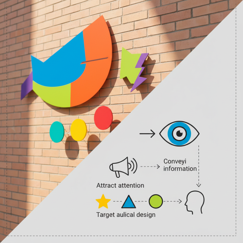
Consider the elements that draw the eye. Bright colors, unique shapes, and readable fonts matter. However, an overwhelming design can confuse passersby. Some signs fail to provide instant clarity. The best designs allow viewers to grasp the message at a glance. Think about visibility from a distance. A sign may look good up close but lose impact further away.
Every detail counts in Outdoor Wall Signage. The location influences design choices significantly. High traffic areas require different considerations than more relaxed settings. Reflect on the target audience. What do they need to see? This understanding shapes stronger signage. Remember, even the most appealing signs can miss their mark if they lack purpose.
Understanding the Importance of Outdoor Wall Signage
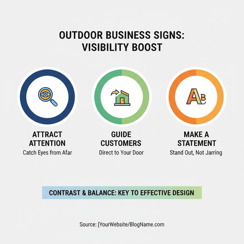
Outdoor wall signage plays a critical role in business visibility. It captures attention, guiding potential customers directly to your location. A well-designed sign stands out against the backdrop of its surroundings. Consider colors that contrast well with the building. Bright colors can draw the eye, but too much contrast can be jarring. Aim for balance.
Effective signage must also communicate clearly. The message should be direct and concise. A complicated slogan may confuse viewers. Focus on essential information like the business name and key offerings. Large, readable fonts help; however, too big can overwhelm the design. Reflect on how your sign fits into the overall environment.
Lighting is another consideration. An illuminated sign can extend visibility during evening hours. But beware of light pollution or excessive brightness. This can lead to complaints or distraction. Testing your sign in different conditions is essential. Walk or drive by as a customer would. What do you notice? Make adjustments based on these observations, ensuring your signage serves its purpose effectively.
Key Elements of Effective Outdoor Signage Design
When designing outdoor wall signage, clarity is paramount. Use bold fonts that are easy to read from a distance. Choose colors that stand out against the background. High contrast helps attract attention. Think of how the sign will look in different lighting. A sign that shines bright in daylight may fade at night.
Incorporating visuals can enhance your message. Icons or images can convey ideas quickly. They break up text and make the sign more inviting. Ensure graphics are relevant to the content. Poorly chosen or unrelated visuals can confuse the audience. Always evaluate the distance from which people will view the sign.
Lastly, consider the placement of your signage. Is it easily visible? Are there obstructions? Test the sightlines from various angles. Sometimes, a sign that seems ideal may not be effective in real-world scenarios. Seek feedback on your designs. Constructive criticism can help improve visibility and impact.
Essential Tips for Effective Outdoor Wall Signage Design
| Element |
Description |
Tips |
| Visibility |
Sign should be easily seen from a distance. |
Use bold colors and large fonts to enhance visibility. |
| Readability |
Text should be easy to read at a glance. |
Limit text and use simple fonts for clarity. |
| Material |
Durable materials that withstand weather conditions. |
Choose weather-resistant materials like metal or treated wood. |
| Lighting |
Illumination for visibility at night. |
Incorporate backlighting or spotlights for night visibility. |
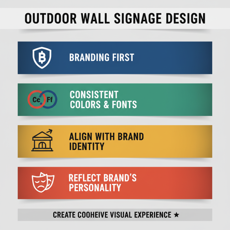
| Branding |
Consistent branding improves recognition. |
Use brand colors and logos prominently. |
| Location |
Strategic placement for maximum exposure. |
Position signs where foot and vehicle traffic is high. |
Choosing the Right Materials for Durability and Visibility
Outdoor wall signage is crucial for visibility. Choosing the right materials is key to ensuring durability and effectiveness. According to industry studies, 60% of consumers notice outdoor signs. This statistic highlights the importance of visibility in design. Signs must withstand weather elements.
Materials like aluminum and acrylic provide both strength and clarity.
Tip: Opt for fade-resistant inks. Colors can diminish over time. Ensure your signage remains vibrant. Quality materials can last longer. A study noted that well-maintained signs can outperform poorly made ones by 40% in visibility.
Tip: Consider reflective materials for night visibility. This choice enhances nighttime engagement, especially in high-traffic areas. Poor lighting can make even great designs ineffective. Remember, your message needs to reach viewers day and night.
Choosing the right materials matters. Some may overlook the cost difference between options. A cheaper sign may save money initially but can lead to increased replacement costs. Evaluate long-term value when making choices.
Strategies for Optimal Placement and Height of Signs
When it comes to outdoor wall signage, placement and height are crucial factors. Research indicates that signs placed between 7 to 10 feet high are often the most visible. This height allows drivers and pedestrians to easily spot them. In fact, a study by the Outdoor Advertising Association shows that proper signage can increase business visibility by up to 50%. Yet, many businesses still overlook this essential aspect.
The distance from which a sign can be viewed significantly influences its design. Signs positioned too close to the ground can be missed entirely, especially in busy urban areas. A good guideline is to consider the average sightline of pedestrians and vehicles. Studies reveal that most people scan their environment from a height of about 5 feet. Therefore, adjusting the height slightly can result in better visibility.
Then, there’s the challenge of location. A poorly placed sign can blend into its surroundings. For example, urban environments with competing visuals can obscure signage. A survey found that nearly 70% of consumers have visited a business simply because of its signage. This highlights the need for thoughtful placement. Reflecting on these insights can prevent costly mistakes in branding and visibility. It's important to reassess current signage strategies regularly.