How to Create Effective Office Signage for Better Wayfinding?
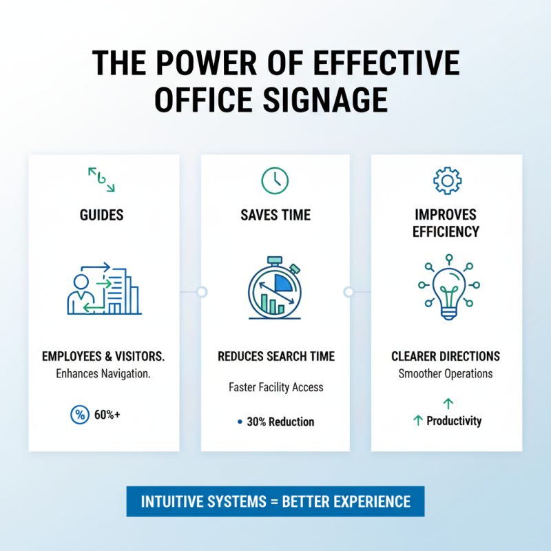
Creating effective office signage is crucial for enhancing wayfinding in any workspace. Office signage serves as a guide, directing employees and visitors throughout the premises. Clear and strategically placed signs can reduce confusion, leading to a more productive environment.
However, crafting ideal office signage is not always straightforward. The use of appropriate colors, fonts, and symbols is vital for visibility. Many offices still struggle with outdated or unclear signs. It’s worth reflecting on how these mistakes can impact daily operations. Signs need to match the flow of the office layout, but often they don't.
Additionally, the balance between aesthetics and functionality can be challenging. Some office signage may look attractive but fails to convey information effectively. Such inconsistencies require attention and improvement. Identifying those areas can transform navigation within the office, making it an easier experience for everyone.

Choosing Effective Signage Materials for Office Environments
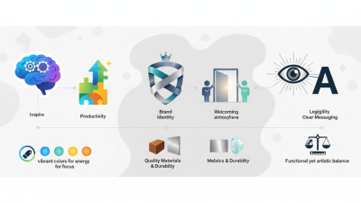
Choosing the right signage materials is crucial for effective office wayfinding. Materials not only impact durability but also the overall aesthetics of the workspace. For instance, acrylic signs can exude a modern feel while being lightweight. Wood offers warmth but may not be ideal for high-traffic areas. Contrast between text and background should always be considered to ensure readability.
When selecting materials, think about maintenance. Some materials, like vinyl, are easier to clean and replace. Others may require professional services for upkeep. It's vital to reflect on how each option fits the office culture. A high-tech company might prefer sleek, metallic finishes, while a creative studio could benefit from colorful, artistic signs.
**Tips:** Always prioritize clarity. Signs should be easy to read even from a distance. Test different options with employees. Gather feedback; it offers valuable insights. Additionally, incorporate tactile elements where possible. They engage multiple senses and enhance navigation. Aim for a balance between functionality and visual appeal.
Design Principles: Color, Typography, and Layout for Signage
Effective office signage plays a crucial role in wayfinding, guiding employees and visitors. Color choices significantly impact visibility and comprehension. According to a report by the International Sign Association, 70% of respondents noted that color enhances their ability to find their way. Bright, contrasting colors can attract attention, but overusing vibrant hues may create visual clutter. A balanced palette enhances clarity while maintaining aesthetic appeal.
Typography is equally essential. A study from the Design Council indicated that 90% of respondents favor legible text. Sans-serif fonts, like Arial or Helvetica, often work well in busy environments. However, too small font sizes can lead to misinterpretation. It's wise to test font sizes and styles before finalizing designs to see how they resonate with users. Consider also the effects of spacing between letters and lines; even minor adjustments can drastically improve readability.
Finally, the layout should guide movement logically. Arranging signs in a sequential manner helps people navigate more intuitively. However, excessive signage can overwhelm individuals. If signs are too densely packed, users may miss important information. Finding a balance between informative and inviting is an ongoing challenge in signage design. Regular feedback from users can lead to necessary adjustments.
User-Centric Approach: Gathering Feedback to Improve Signage Effectiveness
Creating effective office signage requires a focus on user experience. Gathering feedback is crucial. Many signs fail to convey clear messages. Users often find them confusing or misleading. To combat this, organizations should actively seek input from staff and visitors. Surveys, interviews, and casual conversations can uncover valuable insights.
It's essential to analyze real-life interactions with signage. Notice where people hesitate or look lost. These moments highlight areas for improvement. Perhaps icons aren't universally understood. Maybe color choices are not distinct enough. Testing various designs can lead to better outcomes.
Trial and error are part of the process. Not all feedback will align with the original vision. Embrace the imperfections. Continuous adjustments can refine the approach. A user-centric mindset ensures signage evolves. In the end, effective signage transforms navigation into a seamless experience. Engage with users; they are the best source for improvement ideas.
How to Create Effective Office Signage for Better Wayfinding? - User-Centric Approach: Gathering Feedback to Improve Signage Effectiveness
| Signage Type |
Purpose |
Feedback Score (out of 10) |
Improvement Suggestions |
| Directional Signs |
Guide employees and visitors to specific locations |
8 |
Increase visibility and add more icons |
| Informational Signs |
Provide necessary information about facilities |
7 |
Use clearer language and larger font |
| Safety Signs |
Indicate safety protocols and emergency exits |
9 |
Maintain current standards and include color codes |
| Nameplates |
Identify office spaces and personnel |
6 |
Add photos and position titles for clarity |
| Digital Displays |
Broadcast information and updates dynamically |
8 |
Ensure content is up-to-date and visually appealing |