How to Create Eye Catching Stainless Steel Logos That Stand Out
Creating a stunning and memorable Stainless Steel Logo requires a blend of creativity, skill, and an understanding of the unique properties of stainless steel. According to industry expert John Richards, a renowned designer of metal signage, “A well-crafted stainless steel logo can elevate a brand's image and create a lasting impression on customers.” This powerful statement highlights the importance of design choice in the competitive landscape where branding is key to success.
In this guide, we will explore the fundamental aspects of designing eye-catching stainless steel logos that truly stand out. From selecting the right finishes to understanding the various fabrication techniques, each step plays a crucial role in the overall effectiveness of the logo. Steel’s inherent durability and modern aesthetic lend themselves to striking designs that can reflect a brand's identity while also withstanding the test of time.
Ultimately, a well-executed Stainless Steel Logo can convey quality, strength, and sophistication, making it an ideal choice for businesses aiming to distinguish themselves in a crowded marketplace. Join us as we delve into the essential elements that will empower you to create logos that are not only visually appealing but also impactful.

Understanding the Basics of Stainless Steel Logo Design
When it comes to creating eye-catching stainless steel logos, understanding the fundamentals of logo design is crucial. Stainless steel is a material known for its durability and sleek aesthetic, making it a favorite choice for brands that want to convey strength and modernity. Research by the Graphic Artists Guild reveals that an impactful logo is essential for branding, as it is often the first point of contact potential customers have with a company. A well-designed logo can increase brand recognition by 80%, indicating the significant role that effective design plays in consumer perception.
To craft a successful stainless steel logo, designers should consider both form and function. Key design principles such as simplicity, relevance, and versatility must be applied. A report from Statista indicates that 94% of first impressions are design-related, emphasizing the importance of a clean and professional aesthetic. Incorporating textures and finishes of stainless steel can elevate the design further, creating a three-dimensional effect that draws the eye. Color contrasts also play a vital role in logo visibility; research indicates that logos in two contrasting colors are 1.5 times more likely to be remembered than monochromatic designs. Thus, blending the shiny surface of stainless steel with complementary colors enhances the logo's allure and fosters brand recall.
Choosing the Right Design Software for Stainless Steel Logos
When designing eye-catching stainless steel logos, the choice of design software plays a crucial role in bringing your vision to life. Selecting the right tool can make a significant difference in the efficiency of your workflow and the quality of your final product. Popular software options include Adobe Illustrator, CorelDRAW, and Inkscape, each offering unique features that cater to different design styles and preferences. Ensure that the software you choose supports vector graphics, as this format will allow for scalability and precision in your logo design.
Tips for effective logo design include starting with clear sketches or concepts, which can help streamline your digital process. Once you transition to design software, utilize layers to separate different elements of your logo, making adjustments easier and more organized. Additionally, experimenting with textures and finishes in your design will help simulate the look of stainless steel, giving you a more realistic preview of the final product. Remember to keep the design simple yet impactful, as logos should be easily recognizable and memorable to your audience.
Another tip is to take advantage of available online resources and tutorials for your software of choice. Familiarizing yourself with various tools and shortcuts can enhance your design efficiency and creativity. Don’t hesitate to experiment with color variations and gradients, as they can add depth and visual interest to your stainless steel logo. Always keep your target audience in mind, ensuring that your design resonates with their preferences and stands out in a competitive market.
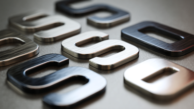
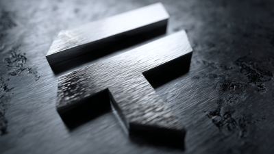
Techniques for Creating Dimension and Depth in Logos
When designing stainless steel logos, incorporating dimension and depth can significantly enhance their visual appeal.
One effective technique is the use of layering, which creates a sense of three-dimensionality. By carefully stacking different elements of the logo,
such as text and icons, designers can produce a more dynamic and engaging look. This method can be further enhanced with shadows or highlights,
giving the logo a realistic metallic sheen that captures light and reflects it beautifully.
Another powerful approach is to utilize gradients and textures in the design. A gradient can add visual interest and depth,
transitioning smoothly between shades that mimic the appearance of brushed or polished stainless steel. Additionally, incorporating textures can provide a tactile quality that draws the eye.
By combining these techniques, designers can craft logos that not only stand out but also resonate with the qualities of durability and elegance associated with stainless steel.
The interplay of light and shadow, along with variations in surface texture, can result in a logo that is both striking and memorable.
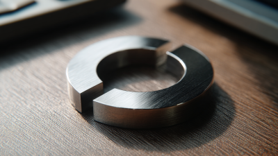
Incorporating Color and Finish for Enhanced Visual Appeal
Incorporating color and finish into stainless steel logos can significantly enhance their visual appeal and make them more memorable. Stainless steel, known for its sleek and modern appearance, can sometimes appear cold and impersonal. By integrating vibrant colors or unique finishes, designers can breathe life into the metal and create logos that resonate with target audiences. For example, using a matte or brushed finish can soften the harshness of steel while adding depth, whereas a polished or mirrored finish can create striking reflections that draw attention.
Color is another vital element in logo design. Adding a splash of color to a stainless steel logo can transform its entire feel, allowing it to evoke specific emotions or thoughts associated with a brand. Whether it’s a vibrant red that communicates energy, a blue that conveys trust, or green that symbolizes growth, the right color choice can elevate the steel's aesthetic. Additionally, using color strategically can help emphasize certain elements of the logo, guiding the viewer’s eye and ensuring that the most important aspects stand out. A well-balanced combination of color and finish not only makes the logo more visually striking but also creates a lasting impression, making it an effective tool for brand identity.
Tips for Testing and Refining Your Stainless Steel Logo Design
Testing and refining your stainless steel logo design is essential to ensure it resonates with your target audience and stands out in a competitive marketplace. According to the Design Council, effective design can contribute up to 32% to a company's revenue growth. Therefore, a well-crafted logo not only enhances brand identity but also plays a crucial role in customer perception. Start by gathering feedback from diverse focus groups to gauge initial reactions to your design. Surveys conducted by marketing professionals suggest that brands that engage in ongoing consumer feedback can see an increase in overall customer satisfaction by as much as 20%.
In refining your design, pay close attention to both aesthetics and functionality. The choice of colors, shapes, and finishes greatly influences the emotional connection customers feel toward your brand. Steel is often associated with strength and durability, and using finishes that accentuate these qualities can enhance the logo's impact. A recent report from the Journal of Brand Management highlights that logos featuring metallic effects increase memorability by approximately 15%. Be prepared to iterate on your initial designs based on testing outcomes, as data indicates that 70% of consumers prefer brands that continually evolve their visual identity to stay relevant.
How to Create Eye Catching Stainless Steel Logos That Stand Out - Tips for Testing and Refining Your Stainless Steel Logo Design
| Design Element |
Description |
Importance |
Testing Method |
| Typography |
The style and arrangement of the letters. |
High - affects readability and personality. |
A/B testing different fonts. |
| Color Palette |
Selection of colors used in the logo. |
Medium - influences emotions and brand perception. |
Feedback surveys on color preferences. |
| Shape |
The geometric design of the logo. |
High - contributes to memorability and recognition. |
Focus groups to gauge initial reactions. |
| Material Finish |
The texture and quality of the stainless steel. |
High - adds a luxury feel to the logo. |
Sample presentations with different finishes. |
| Scalability |
Ability to look good at various sizes. |
Medium - important for usage in different contexts. |
Zoom tests on digital and print platforms. |