How to Choose the Right Channel Letters for Your Business?
Choosing the right channel letters is crucial for your business’s visibility. Renowned signage expert, John Smith, emphasizes, “The right channel letters not only attract attention but also convey your brand’s identity.” This statement highlights the importance of selecting the perfect design.
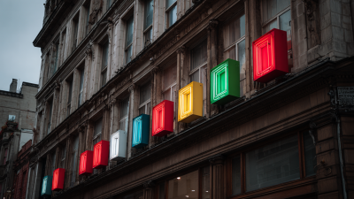
Channel letters come in various styles, sizes, and illumination options. It can be overwhelming for business owners to navigate these choices. Each option holds unique benefits. For example, illuminated channel letters stand out at night, enhancing visibility. On the other hand, non-illuminated letters offer a classic look during the day.
Evaluating your brand’s personality is essential when selecting channel letters. Reflect on your target audience and overall message. What do you want your letters to say about your business? Consider how different colors and fonts will resonate with potential customers. The selection process may seem daunting, but thoughtful decisions can lead to a striking and effective marketing tool.
Understanding Channel Letters and Their Importance for Businesses
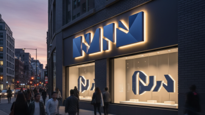
Channel letters are vital for any business looking to enhance visibility. These three-dimensional signs come in various shapes, sizes, and materials. They can effectively draw attention and convey a brand's message. According to the Sign Research Foundation, effective signage can increase sales by up to 20%. That's a significant impact from a simple visual tool.
Understanding the construction of channel letters is crucial. They typically consist of a metal frame, plastic face, and LED lighting. This combination not only ensures durability but also promotes energy efficiency. A report from the International Sign Association indicates that illuminated signs attract 50% more customers than non-illuminated ones. This reinforces the importance of choosing the right style and design for your business.
However, not all signs will suit every business. It's essential to reflect on your brand identity and location. Some designs may not resonate well with your target audience. An expensive and elaborate sign may not guarantee success if it doesn't align with your brand’s message. Take time to evaluate what fits your vision and your budget before making a choice.
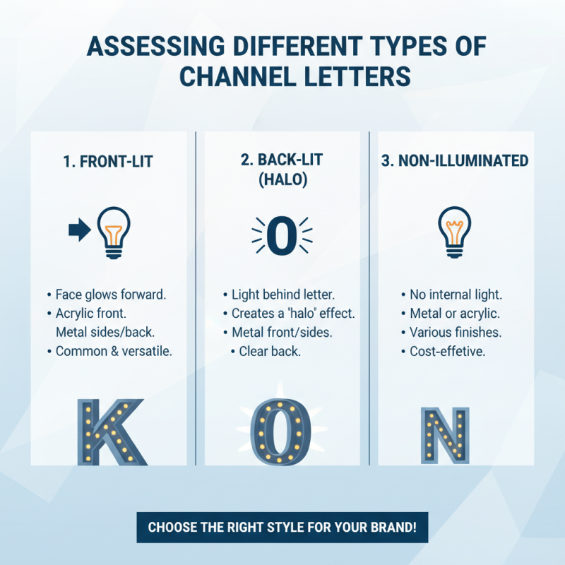
Assessing the Different Types of Channel Letters Available
When selecting channel letters for your business, understanding the types available is crucial. Channel letters come in various styles. Some are illuminated, while others are not. Each option has its own appeal and function.
LED channel letters offer bright visibility, ideal for attracting attention at night. These letters use energy-efficient lighting. However, they may require more maintenance. Non-illuminated letters can provide a classic look. They are often less costly and easier to install. Think about your brand image.
Tips: Consider your location. If your business is in a high-traffic area, bright letters are advantageous. Reflect on your budget, too. The initial cost of illuminated letters can be steep. Sometimes, less is more with signage. Simple, clear letters may communicate your brand effectively. Always check your local regulations. They dictate size and style options.
Factors to Consider When Choosing Channel Letter Materials
Choosing the right materials for channel letters is crucial for any business. The material affects durability, appearance, and cost. Common options include acrylic, metal, and PVC. Each has its advantages and disadvantages. For example, acrylic is lightweight and easy to cut. However, it may not withstand harsh weather as well as metal.
Metal channel letters are sturdy and offer a sleek look. They can last longer but come at a higher price. You need to consider your budget carefully. Reflect on how long you plan to use the signage. If it’s a long-term investment, metal may be worth it. PVC, on the other hand, is cost-effective and versatile. Yet, it might not have the same visual appeal.
Another critical factor is maintenance. Some materials require more upkeep than others. This can become a hassle. Do you intend to clean your signs regularly, or would you prefer a low-maintenance option? Think about your business environment. Factors like exposure to sunlight or moisture can affect material choice. It’s all about finding the right balance for your specific needs.
How to Choose the Right Channel Letters for Your Business? - Factors to Consider When Choosing Channel Letter Materials
| Material Type |
Durability |
Weight |
Cost |
Maintenance |
Best Use Case |
| Aluminum |
High |
Lightweight |
Medium |
Low |
Outdoor signs |
| Acrylic |
Medium |
Lightweight |
Low |
Medium |
Indoor decor |
| PVC |
Medium |
Lightweight |
Low |
Medium |
Temporary signage |
| Stainless Steel |
Very High |
Heavy |
High |
Very Low |
Premium signage |
| LED |
High |
Medium |
Medium |
Low |
Illuminated signs |
Evaluating Illumination Options for Effective Channel Letters
Choosing the right illumination for channel letters is crucial for business visibility. The type of lighting can significantly impact how your signs are perceived. LED lighting is a popular choice due to its efficiency and brightness. However, neon and fluorescent options also offer unique aesthetics.
When evaluating illumination options, consider the color temperature. Warm colors create an inviting atmosphere, while cool colors offer a modern feel. Test different color outputs with your channel letters before making a final decision. A well-lit sign can attract more customers, and poorly lit signs may lose attention.
Tips: Always check the brightness level. You want your sign to stand out, but not be blinding. The location of your sign matters too. Ensure there are no obstructions blocking the light. Install dimmers for flexibility based on time of day.
Remember, reflect on your surroundings. A flashy sign might clash with a historic building. Ask for feedback from peers. Their insights can shape your final choice. Balancing aesthetics and functionality is key to success.
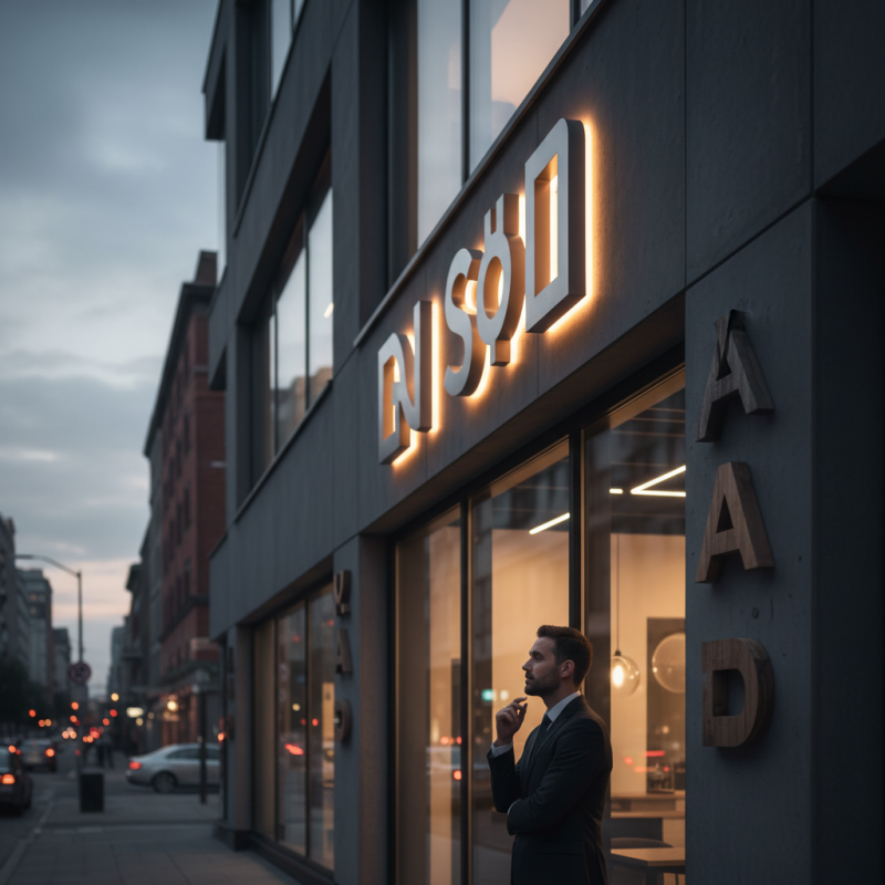
Placement and Installation Considerations for Channel Letters
When selecting channel letters for your business, placement and installation are critical. First, think about the visibility. Placing channel letters at eye level typically enhances visibility. Consider how the letters interact with surrounding structures. If there are trees or signs blocking the view, your letters may go unnoticed.
Lighting is another vital aspect. Well-lit channel letters stand out, especially at night. Choose LED illumination for both energy efficiency and brightness. However, be cautious; too much light can create glare and obscure your message. Reflect on the environment. Urban areas might require more vibrant options than quieter suburban settings.
Tips: Evaluate your location thoroughly. Spend time observing foot traffic and vehicular movement. This insight helps in choosing the best placement. Remember, aesthetics matter, but functionality is paramount. Regularly check your signage for wear and tear. You want your letters looking crisp and new at all times.