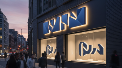
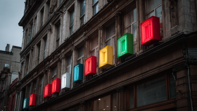
A storefront has only a few seconds to make an impression. A driver passes in afternoon glare. A customer searches for your entrance after dark. Channel Letters can make your business name visible, but the right choice depends on more than brightness. Size, color, lighting, mounting, and viewing distance all shape what people actually see.
Sign designer Dan Antonelli is known for connecting signage with brand identity. A concise paraphrase of that approach is: “A sign should make the brand clear before it tries to impress.” That distinction matters. A bold halo-lit face may suit a boutique hotel, while bright front-lit letters may work better for a busy retail strip. Neither is automatically right. Even a beautiful sign can disappear against a crowded façade.
This guide helps you compare channel-letter styles, illumination, materials, and installation options. It also considers practical details: a dark brick wall, nearby streetlights, and the distance between your sign and passing customers. Start with the message. Then consider the setting. Check how the letters look in daylight and after sunset, not just in a product photo. Ask about maintenance, visibility, and how the sign fits your existing branding. Small choices matter. One caution: recommendations can miss the mark when they ignore a building’s actual lighting and viewing angles. Use the guidance here as a starting point, then review your site before choosing a design.
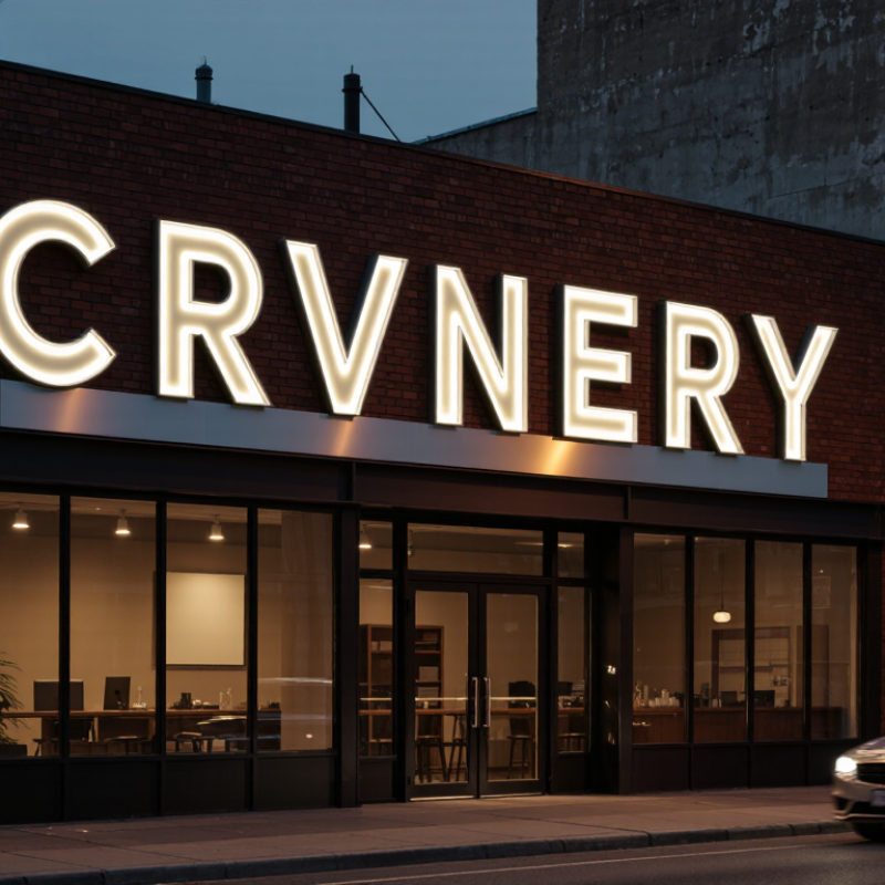
Channel letters are individually made, three-dimensional characters mounted on a building, canopy, or sign panel. Their sides create depth, while the faces may be illuminated or left unlit. Some designs shine through the front; others cast light onto the wall behind them. The construction affects how the sign looks in daylight and after dark.
These letters identify a business through more than its name. Their shape, spacing, color, and lighting create a visual impression that people can recognize from the street. At a busy shopping area, clear lettering and strong contrast help a storefront stand out among windows, traffic, and neighboring signs. Small details matter. A narrow font may look elegant up close but become hard to read from across a parking lot.
Choosing a style means considering the building, viewing distance, and typical light conditions. For example, warm illumination may suit a relaxed dining space, while crisp, evenly lit letters can feel appropriate for a professional office. Brighter is not always clearer; excessive glow can blur letter edges at night. There is no perfect formula. Review material samples and nighttime photos when possible, and check how the letters appear from the sidewalk, not only on a screen. A sign can look polished in a mockup and still feel oversized once installed.
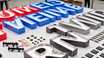
Assess your sign from the places customers will actually see it: across a parking lot, from a moving car, or beneath a deep awning. Measure the viewing distance and note the approach angle. A sign that reads clearly head-on may disappear from the side. The Sign Research Foundation’s 2012 report on on-premise signage cites consumer survey findings that 76% of respondents had entered an unfamiliar business because of its sign. That makes visibility a practical business concern, not just a design preference. Still, distance alone is a rough guide. Test letter size and spacing from the sidewalk and curb before settling on a layout.
Study the location at different times of day. Tree shadows, bright windows, parked vans, and neighboring signs can compete with your lettering. The same report cites a finding that 68% of consumers had purchased a product or service after a sign caught their attention. Consider illumination and contrast against the building, then check how both look in daylight and after dark. A white face may stand out on brick but wash out against a bright glass façade. Take photos from customer eye level. Review them later; glare can fool you. If the sign is hard to read at a glance, simplify the wording or adjust the letter height before installation.
Choosing channel letters starts with the wall, not the catalog. Aluminum returns are lightweight and resist rust, while acrylic faces diffuse light evenly. Stainless steel can suit a refined finish, but coastal air and cleaning routines matter. Ask for samples beside your actual façade; colors can shift under warm streetlights. Small detail, big difference.
Then compare the look. Front-lit letters make names easy to read after dark. Halo-lit letters cast a softer glow behind each character, but need space between the letter and wall. Open-face styles expose the light source and may feel brighter or more industrial. Look closely. Check letter depth, stroke width, and viewing distance before approving artwork. A beautiful thin font can disappear across a wide parking lot.
For illumination, LEDs usually offer lower operating costs than older light sources. The U.S. Department of Energy reports that LEDs use at least 75% less energy and can last up to 25 times longer than incandescent lighting. That is a broad lighting comparison, not a promise about a complete sign system. Ask for a load estimate, service access details, and a night-time mock-up. Test at dusk. I would not choose the brightest sample by default; glare can make letters harder to read, and the perfect color on screen may look wrong outdoors.
| Comparison Dimension | Option | Typical Characteristics | Best Suited For | Points to Consider |
|---|---|---|---|---|
| Letter Material | Aluminum returns | Lightweight, corrosion-resistant, and commonly formed into the side walls of channel letters. Often paired with a separate face material. | Many indoor and outdoor channel-letter projects where a balance of durability and manageable weight is needed. | Finish, wall thickness, fabrication quality, and local weather exposure affect long-term performance. |
| Letter Material | Acrylic faces | Translucent sheet material available in multiple colors; commonly used to transmit light in front-lit letters. | Front-lit signs that need an evenly illuminated colored face. | Color appearance can vary between daylight and nighttime illumination. Select material intended for outdoor sign use when exposed to weather. |
| Letter Material | Stainless-steel faces or returns | Offers a metallic appearance and can provide good corrosion resistance, particularly with appropriate grade and finish selection. | Projects seeking a metal finish, including halo-lit or non-illuminated lettering. | Costs and weight can be higher than aluminum. Corrosion resistance depends on the stainless grade, finish, environment, and maintenance. |
| Letter Material | PVC or other rigid plastics | Can be used for some dimensional sign components and indoor applications; suitability depends on the specific product and construction. | Interior signs or projects where the selected plastic is rated for the intended conditions. | Do not assume every plastic is suitable for long-term outdoor exposure, structural use, or illuminated faces; confirm product specifications. |
| Letter Style | Standard channel letters | Three-dimensional letters with formed returns and a face; may be illuminated or non-illuminated. | Building façades and storefronts where dimensional visibility is desired. | Confirm mounting method, letter depth, viewing distance, and applicable sign-code requirements. |
| Letter Style | Reverse channel letters | Typically have an opaque front and open back, directing light toward the wall to create a halo effect. | Locations with a suitable wall surface and a preference for indirect illumination. | Halo appearance depends on wall color, texture, letter spacing, mounting distance, and ambient light. |
| Letter Style | Combination front-and-halo letters | Designed to emit light through the face and toward the mounting surface. | Signs intended to combine direct face visibility with a backlit outline. | More lighting and fabrication details need coordination; review a nighttime rendering or sample where practical. |
| Illumination | Front-lit LED | LED modules illuminate a translucent letter face. LEDs are widely used in channel letters because they are compact and energy-efficient compared with many traditional lighting sources. | Storefronts and building signs that need the letter face to remain prominent after dark. | Brightness, color, module spacing, power supply access, and heat management should be specified for the sign design. |
| Illumination | Halo-lit LED | LEDs direct light behind the letter, producing reflected illumination on the mounting surface rather than a glowing face. | Signs where a softer, indirect nighttime effect is preferred. | Requires a surface that reflects light effectively. Dark, uneven, or highly textured surfaces can reduce or alter the halo effect. |
| Illumination | Non-illuminated | Dimensional letters rely on ambient or external lighting and have no internal light source. | Interior signs, well-lit locations, or projects where nighttime illumination is not required. | Visibility after dark depends on site lighting and the contrast between the letters and their background. |
| Selection Check | Site, installation, and maintenance | Sign size, mounting surface, viewing distance, weather exposure, electrical access, and access for servicing all influence the right specification. | Every project, before finalizing materials, lighting, and fabrication. | Check local permitting and sign regulations, structural and electrical requirements, warranty terms, and service access with qualified professionals. |
Tip: Compare complete sign specifications—not material names alone—including face and return materials, lighting layout, mounting method, electrical components, and maintenance access.
Channel letters should feel like a natural extension of your brand, not a separate design. Start with the logo’s proportions, letter spacing, and main colors. A heavy sans-serif font can stay readable across a wide street. Thin strokes may disappear at a distance. Check a full-size mockup from the sidewalk, not just on a screen. Warm lighting can soften a welcoming storefront; crisp white light may suit a more technical service. It is easy to overvalue visual impact. Readability matters more.
Local signage rules can shape the design as much as the brand does. Cities and property managers may limit letter height, sign area, brightness, mounting methods, or placement. Historic districts can have added review steps. Ask the local planning or permitting office, and check lease requirements before ordering. Share a drawing that shows dimensions, colors, lighting, and mounting details. Keep written approvals. Requirements vary, so confirm the current rules for the exact address.
Tips: Photograph the storefront in daylight and after dark. Compare letter samples against the building surface. If the sign feels crowded, simplify it; a small design compromise may improve legibility.
Installation affects both appearance and long-term cost. Ask for a site survey that checks the wall surface, wiring route, mounting method, and access for future repairs. A sign mounted over uneven brick may need custom spacers; that detail can change labor costs. Compare quotes that separately list fabrication, installation, electrical work, permits, and equipment rental. A low total can hide important exclusions.
Maintenance deserves attention before you approve the design. Ask how technicians will reach the power supply and replace individual modules without removing the whole sign. The U.S. Department of Energy’s Energy Saver guidance says LEDs use at least 75% less energy and last up to 25 times longer than incandescent lighting. That is a useful benchmark, not a guaranteed saving for every channel-letter sign. Actual costs depend on operating hours, components, and local service rates. It is easy to focus on the purchase price and overlook a difficult-to-access repair.
Tips: Request a written three-to-five-year cost estimate covering energy, inspections, likely repairs, and access equipment. Check what the warranty excludes, especially labor and weather-related damage. Keep the comparison realistic; some maintenance costs are hard to predict. A little uncertainty is normal.