How to Choose the Best Shop Signs for Your Business in 2026?
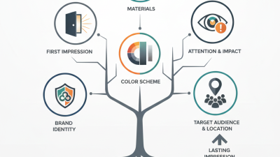
In 2026, selecting the right shop signs is more critical than ever. A well-designed sign can attract customers and convey your brand’s essence. The competition is fierce, and businesses need an edge. Quality shop signs convey professionalism. They can enhance visibility and set the tone for the customer experience.
Consider the materials you choose. They should withstand weather changes and still look appealing. Think about the colors and fonts. Bright colors grab attention, but not all shades resonate with every audience. Customization is key. Your shop sign should reflect the unique aspects of your business. However, simplicity often outweighs complexity.
Don’t forget about the placement. A great sign improperly positioned can lose its purpose. Take a moment to reflect on what works and what doesn’t. It’s easy to overlook details. Listen to customer feedback. They can offer valuable insights on what catches their eye. Choosing the best shop signs requires a balance of creativity and practicality.
Factors to Consider When Selecting Shop Signs for Your Business
When selecting shop signs for your business, it’s essential to consider several factors carefully. The design should reflect your brand identity. A well-designed sign can attract customers and communicate your message. Colors, fonts, and graphics must align with your overall branding strategy. Unique designs stand out in a crowded marketplace. However, balancing creativity and clarity is essential. A sign that is too complex may confuse potential customers.
Another important factor is location. Your sign's visibility affects its effectiveness. Consider how far away passersby can read it. High traffic areas may require larger signs for better visibility. Think about local regulations as well. Some areas have restrictions on sign type and size. Ignoring these rules may lead to fines or removal.
Material choice also plays a critical role in durability and aesthetics. Weather-resistant materials can extend your sign's life. However, certain materials may not convey the quality you desire. It’s important to reflect on these aspects thoroughly. A sign with too many elements may overwhelm viewers. Finding a balance between enticing design and practicality is vital for success. Your sign should invite inquiries, not deter them.
Understanding the Importance of Visibility and Legibility in Shop Signs
When selecting shop signs, visibility and legibility must be your top priorities. A sign should be readable from a distance. Use clean fonts and high-contrast colors. This makes it easier for potential customers to spot your business.
It’s critical to avoid overly intricate designs that can confuse passersby. Each element of the sign needs to contribute to its overall clarity.
Think about the size and placement of your sign. A small sign near the ground may be missed by people on the street. Height can increase visibility, but it should also be designed with legibility in mind.
Test different distances; your sign should be clear from at least 50 feet away. If not, adjustments are necessary.
Remember that the typeface matters enormously. Some fonts can look stylish but may sacrifice readability. Ensure your message stands out.
Use bold letters for the name of your business but keep additional information simple.
Consider feedback from others on your sign. Not every design will resonate, and this can be a crucial step in getting it just right.
Exploring Different Types of Shop Signs: Materials and Styles
In 2026, selecting the right shop sign is crucial for visibility and branding. Storefront signs come in various materials and styles, each with unique advantages. Research suggests that 76% of consumers enter a store based on signage alone. This highlights the importance of choosing materials that resonate with your target audience.
Acrylic and aluminum are two popular materials for signs. Acrylic offers a sleek, modern look. It’s lightweight and can be produced in various colors. Aluminum, on the other hand, is durable and resistant to weather conditions. It conveys a sense of permanence and professionalism. For instance, a study found that well-designed signs can increase customer recall by 50%. However, the choice of material should consider the local climate and intended message.
Stylistically, illuminated signs stand out in urban environments. They grab attention, especially at night. Meanwhile, wooden signs provide a rustic charm. This can appeal to businesses focusing on organic or handcrafted products. Yet, not all designs work universally. Some may clash with a brand's identity. Regularly assessing their effectiveness is vital. Ultimately, the right shop sign is not merely decorative; it serves as a vital communication tool for your business.
Evaluating Local Regulations and Zoning Laws for Shop Signs
When selecting shop signs, local regulations and zoning laws must be a priority. These rules can dictate sign size, height, illumination, and location. A 2022 study by the International Sign Association (ISA) found that businesses with compliant signs experience a 20% increase in foot traffic compared to those with non-compliant signs. Understanding these local nuances can help avoid costly fines or redesigns.
Tip: Always check local zoning laws before finalizing your design. Many municipalities have specific guidelines that can influence your sign's impact. Ignoring these can lead to setbacks.
Another factor to consider is aesthetic standards. Some communities prioritize sign styles that align with their overall branding. For example, research from the National Association of Realtors highlights that attractive signs increase perceived value. Failing to respect these standards could alienate potential customers.
Tip: Consult with local authorities and neighbors. Seek feedback on your design ideas. This can lead to a sign that meets regulations and resonates with the local community.
The process may feel tedious, but covering these bases can enhance your shop's visibility. A well-placed, compliant sign can make a lasting impression. Remember that a sign is often the first interaction customers have with your business. Prioritize clarity and adherence to guidelines for the best outcome.
How to Choose the Best Shop Signs for Your Business in 2026? - Evaluating Local Regulations and Zoning Laws for Shop Signs
| Sign Type |
Material |
Estimated Cost |
Local Regulations |
Zoning Laws |
| Lighted Sign |
Plastic/Metal |
$1,500 - $3,000 |
Permits required for brightness |
Restricted in residential zones |
| Digital Sign |
LED |
$2,500 - $5,000 |
Time of use restrictions |
May require special zoning |
| Wall-Mounted Sign |
Wood/Metal |
$500 - $1,500 |
Must match building aesthetics |
Height restrictions apply |
| A-Frame Sign |
Wood/Plastic |
$200 - $500 |
Temporary usage allowed |
No restrictions in commercial zones |
| Window Sign |
Vinyl Decals |
$100 - $300 |
Content regulations apply |
No limitations in most zones |
Tips for Designing Eye-Catching and Effective Shop Signs
When designing shop signs, clarity is key. Use large, legible fonts that can be read from a distance. Consider the colors you choose; contrasting colors grab attention. A bright, warm color palette, like yellow and red, can evoke excitement and draw people in. Remember, your sign reflects your brand. It should feel authentic to your business.
Simplicity is often overlooked. A crowded sign can confuse potential customers. Limit text and focus on essential information like your business name and services. Add a graphic element that symbolizes what you offer; a visual cue can be more memorable than words alone. Think about the materials too. Wood, metal, or acrylic all convey different vibes. Pick one that aligns with your brand identity.
Lastly, don't forget the location of your sign. Is it placed at eye level? Is there good lighting? A well-placed sign can attract walk-in traffic, while a poorly positioned one might go unnoticed. Regularly assess the effectiveness of your sign. Change it if it no longer reflects your business or if it looks worn. The best designs evolve with your brand.
Shop Sign Design Preferences for Businesses in 2026