Essential Checklist for Designing Effective Backlit Signs
In the ever-evolving world of advertising and signage,
backlit signs have emerged as a highly effective medium for
capturing consumers' attention. According to a report by the
Sign Research Foundation,
illuminated signs can increase visibility by
50% or more, making them a crucial component of a brand's marketing strategy.
As businesses strive to stand out in a crowded marketplace,
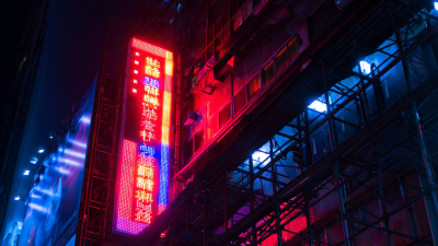
the importance of designing effective backlit signs cannot be overstated. These signs not only enhance visibility during evening hours
but also convey a modern and professional image that resonates with consumers.
This blog aims to provide an essential checklist for creating impactful backlit signs, ensuring that businesses can
maximize their advertising potential while aligning with industry best practices.
With the right design elements in place, backlit signage can become a powerful tool in a company's overall branding strategy.
Common Issues in Backlit Sign Design and How to Avoid Them
When designing effective backlit signs, it's crucial to be aware of common issues that can detract from their impact. One prevalent problem is inadequate illumination, which can lead to uneven lighting across the sign surface. Research indicates that well-lit signs increase visibility by up to 50%, making proper light distribution essential. To avoid this, designers should consider the type of lighting used and the distance between the light source and the sign material. Using LED lights, for instance, can provide a more consistent illumination compared to traditional options.
Another common challenge is material selection. Many signs fail due to the choice of flimsy or low-quality materials that do not hold up under various environmental conditions. According to a study by the International Sign Association, nearly 70% of consumers notice poorly maintained signs, which can tarnish a brand's image. To mitigate this, opting for durable, weather-resistant materials can enhance the longevity and effectiveness of backlit signs, ensuring they remain visually appealing over time. With careful consideration of these factors, designers can significantly reduce the likelihood of common design pitfalls and create signs that are both functional and aesthetically pleasing.
Essential Checklist for Designing Effective Backlit Signs - Common Issues in Backlit Sign Design and How to Avoid Them
| Dimension |
Common Issues |
Tips to Avoid Issues |
| Brightness |
Inconsistent lighting |
Use uniform LED lights |
| Material |
Poor light diffusion |
Choose high-quality diffusing acrylic |
| Size |
Overly large signs |
Design based on viewing distance |
| Color |
Clashing colors |
Select complementary colors |
| Content |
Too much text |
Prioritize concise messaging |
| Installation |
Improper mounting |
Follow manufacturer installation guidelines |
| Maintenance |
Neglected upkeep |
Schedule regular cleanings |
Navigating Color Choices: The Pitfalls of Poor Color Contrast
When designing backlit signs, color contrast plays a crucial role in ensuring visibility and effectiveness. According to a report by the International Sign Association, poor contrast can reduce readability by up to 70%, directly impacting customer engagement. A sign that effectively navigates color choices not only captures attention but also conveys the desired message swiftly, making the choice of contrasting colors paramount.
Research suggests that high contrast between text and background enhances legibility from greater distances. For instance, studies conducted by the Clear Channel Outdoor reveal that well-contrasted signs can improve recognition by 45%. This is particularly critical for backlit signs in environments with varied lighting conditions, where the right combination of colors ensures that the sign remains visible day and night. Therefore, designers must prioritize color theory and contrast principles, opting for combinations that stand out while fitting within the overall branding strategy.

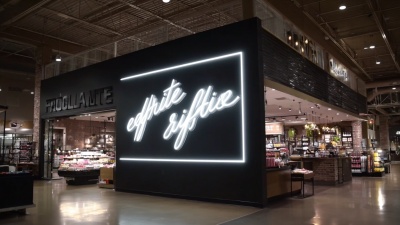
Font Selection Follies: Choosing Legible Typefaces for Visibility
When designing effective backlit signs, one of the most critical elements is font selection. The legibility of typefaces plays a pivotal role in how well a sign conveys its message, especially in low-light environments. According to a study published by the International Sign Association, nearly 70% of respondents reported having difficulty reading certain fonts from a distance, underscoring the importance of choosing the right typeface for visibility.
When selecting fonts, opt for sans-serif typefaces, as they are typically easier to read in illuminated contexts. Fonts like Helvetica and Arial are excellent choices because they offer clarity and straightforwardness. Avoid overly decorative fonts or those with intricate details, as these can reduce legibility, especially at larger distances. A rule of thumb is to ensure that letter heights are at least 1 inch per 10 feet of viewing distance.
Tip: Test the visibility of your chosen typeface by printing examples at various sizes. Another useful tip is to maintain a high contrast between the font color and the sign’s background. Studies show that a contrast ratio of at least 4.5:1 significantly enhances readability, making your backlit sign both effective and attractive.
Illumination Challenges: Ensuring Even Lighting Across Your Design
When designing backlit signs, achieving even lighting is one of the primary challenges that creators face. Uneven illumination can result in dull patches, shadows, or overly bright spots, detracting from the overall effectiveness of the sign. To overcome this issue, careful consideration of the light source placement is crucial. For instance, LED strips can be strategically positioned along the edges of the sign or behind diffusing materials to ensure that the light spreads evenly. Additionally, opting for high-quality diffusers can significantly enhance light uniformity, allowing for a softer glow that enhances visibility and aesthetics.

Another key factor to consider is the thickness and translucence of the materials used. The choice of acrylic or polycarbonate can impact how light is diffused. Thinner materials may yield brighter spots, while thicker, frosted materials could help in distributing the light more evenly. It’s also important to experiment with different color temperatures to find the right balance that complements the overall design. By addressing these illumination challenges, designers can create backlit signs that not only stand out but also deliver a consistent and visually appealing viewing experience.
Materials Matter: The Impact of Signage Materials on Backlighting
When designing effective backlit signs, the choice of materials is paramount. The materials not only influence the overall aesthetic but also affect the efficiency of backlighting. High-quality materials, such as acrylic and polycarbonate, provide excellent light diffusion, maximizing visibility and appeal. Additionally, incorporating materials that enhance durability is crucial, as signage is often subjected to varying environmental conditions. A recent industry report highlighted that signs made with premium materials can demonstrate a longevity increase of up to 30% compared to those made with lower-quality alternatives.
**Tips:** Always consider the light transmission properties of materials. Opt for materials with a high light transmission rate to ensure that your backlit signage shines brightly, even in daytime conditions. Furthermore, during the design phase, take into account how different colors and finishes will interact with backlighting. For instance, lighter colors can enhance brightness but may require more powerful light sources to avoid a washed-out appearance.
Investing in the right materials extends beyond aesthetics; it plays a significant role in the lifespan of the signage. A comprehensive purchasing strategy should include considerations for the longevity of components like LEDs. Recent insights indicate that while LED specifications can be misleading, brands that focus on high-quality materials see an increase in the lifespan of their entire display system, often resulting in reduced maintenance costs and enhanced visual performance over time.