What are 3D Letters and How to Use Them Effectively?
In the modern marketing landscape, 3D letters have surged in popularity. They serve as an eye-catching medium that conveys messages with depth and dimensionality. According to a recent industry report by Market Research Future, the demand for 3D signage has increased by 22% over the past three years. This rise highlights their effectiveness in capturing consumer attention. Expert Sarah Thompson notes, "3D letters create a visual appeal that traditional signage simply can't match."
Using 3D letters effectively requires strategic placement and appropriate sizing. They should resonate with the brand’s identity and attract the right audience. For instance, a well-placed 3D letter sign at a bustling shopping mall can enhance visibility and foot traffic. However, businesses often overlook the importance of color contrast and lighting. Inadequate attention to these elements may lead to less impactful designs that fail to engage viewers.
While 3D letters are powerful tools, they are not without their challenges. Budget constraints can restrict their use, and poor design choices can diminish their effectiveness. Continuously reflecting on these aspects helps companies optimize their signage strategies. Embracing 3D letters can revolutionize branding efforts when done thoughtfully.
What are 3D Letters and Their Characteristics?
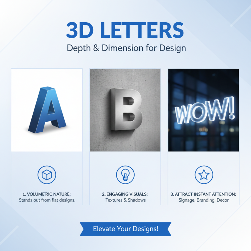
3D letters are a compelling design element. They add depth and dimension to various projects. Whether for signage, branding, or decoration, they attract attention instantly. One key feature is their volumetric nature. This characteristic allows them to stand out from flat designs. The textures and shadows they generate create a more engaging visual experience.
When using 3D letters, consider their placement carefully. Positioning can greatly impact visibility. Tips: Create contrast with the background. Dark letters on a light wall can be striking. Also, think about scale. Large letters can dominate a space, while smaller ones work well in intimate settings.
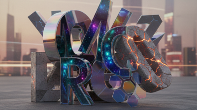
Moreover, choose materials wisely. Wood, metal, or acrylic can all bring different vibes. Reflect on the message you want to convey. A polished metal letter feels modern, while wood gives a rustic touch. The aim is to align the material with your brand's identity. Remember, not every choice will resonate. Some may feel too overwhelming or mismatched. Test different combinations to find the perfect fit.
Different Materials Used for Creating 3D Letters
3D letters can transform any space, making messages pop. When creating them, the choice of material significantly impacts their overall look and durability.
One popular option is foam. It's lightweight and easy to manipulate. Foam letters work well for indoor settings. However, they may not withstand outdoor conditions well. Consider your environment when choosing foam.
Wood is another great material. It offers a rustic feel and can be painted or stained. Wooden letters are sturdy and ideal for signage. But, they can be heavy. Make sure your mounting solution can support them.
A fun alternative includes acrylic. This plastic material shines with brightness and can be transparent or colored. Acrylic letters are perfect for modern designs but can scratch easily. Keep them clean to maintain their appeal.
Tips: Always think about the environment where your letters will be displayed. Test the mounting hardware to avoid falls. When using materials like wood or acrylic, consider weight and installation challenges.
Applications of 3D Letters in Various Industries
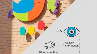
3D letters are becoming essential in various industries. Their dimensional appearance creates visual interest that flat designs lack. In retail, 3D signage helps brands capture attention. Around 60% of consumers are drawn to bold, three-dimensional letters. This can lead to increased foot traffic.
In the education sector, 3D letters enhance learning environments. Schools use them for signage and classroom decor. According to studies, environments that stimulate visual engagement can boost retention by 20%. However, not all installations are perfect. Poor placement or excessive use can clutter spaces.
Entertainment venues also leverage 3D letters creatively. From movie theaters to theme parks, they create thematic experiences. They engage visitors emotionally and lead to longer stays. However, maintaining these installations is crucial. Weather and wear can age signage quickly. Regular updates and repairs are necessary for impactful messaging.
What are 3D Letters and How to Use Them Effectively? - Applications of 3D Letters in Various Industries
| Industry |
Application |
Benefits |
Example Use Case |
| Retail |
Store Signage |
Enhances visibility and attracts customers |
3D letter signs on storefronts |
| Education |
Wayfinding Signs |
Improves navigation and accessibility |
3D letters indicating classroom locations |
| Events |
Stage Displays |
Creates a memorable visual impact |
3D letters as part of a backdrop for events |
| Hospitality |
Brand Signage |
Enhances brand recognition and ambiance |
3D letters at hotel entrances or lobbies |
| Real Estate |
Property Signage |
Attracts potential buyers and enhances listings |
3D letters for sale signs on properties |
Tips for Designing Eye-Catching 3D Lettering
3D lettering can transform your design projects. Proper use adds depth and intrigue to visuals. Studies show that 3D design can increase viewer engagement by up to 300%. This means more eyes on your audience. But how do you create eye-catching 3D lettering?
Start with color. Bold colors can make letters pop. Use contrasting shades to draw attention. According to a report, colors can influence emotional responses by 80%. Select colors that align with your message. Simplicity matters too. Avoid cluttered designs that confuse viewers. Clear, legible letters help convey your idea.
Consider the font. A unique font can set your work apart. But be cautious—overly stylized fonts may be hard to read. Balance creativity with clarity. Textured surfaces can enhance your design. They add a tactile element that captivates interest. However, too many textures can overwhelm. Be mindful of visual harmony. Ultimately, experiment and refine your approach. You might find that less is more.
Effective Ways to Install and Display 3D Letters
3D letters add depth and personality to any space. Installing them requires careful planning. Choose a location that enhances visibility. Think about lighting. Proper illumination makes the letters more striking.
When displaying 3D letters, consider the materials. Wood offers warmth; metal gives a modern touch. Mixing textures can create visual interest. Keep in mind the size of the letters. They should be proportionate to the surrounding space. Large letters can be overwhelming in a small room.
Think about the context. 3D letters in a corporate setting might need a sleek design. In a child's room, playful fonts work better. Experiment with different arrangements before making them permanent. The process has its challenges. It’s easy to misjudge proportions or placement. A little trial and error can lead to surprising results.