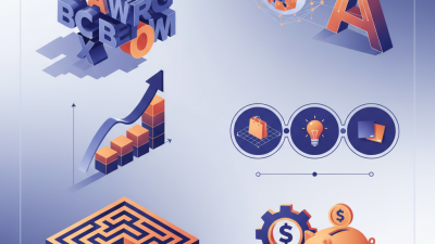
3D Letter Tips for Effective Branding and Design Strategies?
In the evolving world of branding, 3D letters stand out. Experts like Mark Johnson, a leading designer in the field, emphasize their impact by stating, "3D letters engage audiences in ways flat text simply cannot." The depth and dimension of 3D lettering can elevate a brand’s identity significantly.
As consumers navigate through messages, the visual appeal of a 3D letter captures attention. This technique incorporates texture and shadow, leading to a more immersive experience. Brands often overlook how the right typography affects audience perception. Mistakes in design can lead to misunderstandings. Choosing the wrong color or style can diminish effectiveness.
Exploring effective strategies is crucial. Consider the font shape and size to resonate with your target market. Each design decision should reflect the brand's core values. Reflect on the balance between creativity and clarity. Crafting a memorable brand identity with 3D letters is an ongoing journey of learning and refinement.

Understanding the Basics of 3D Lettering in Branding Design
3D lettering has transformed branding design, offering a unique and artistic touch. It creates depth and perspective, making logos more visually striking. A study by the Design Management Institute revealed that design-led companies outperform peers by 228% over ten years. This highlights the significance of well-crafted visuals in marketing.
Understanding the basics of 3D lettering is crucial for creating impactful designs. Techniques such as extrusion and shadowing can enhance readability. Colors and textures further enrich the visual appeal. A report from Adobe states that 73% of marketers believe engaging visuals lead to better communication. This suggests that brands using 3D lettering can capture audience attention more effectively.
Despite its advantages, implementing 3D lettering poses challenges. Designers may struggle with balancing complexity and clarity. Overly intricate designs can overshadow the brand message. It's essential to test audience reactions and critique designs. Continuous iteration is important. Brands can refine their visuals to ensure they resonate well with their target market.
Choosing the Right Fonts and Colors for 3D Letters
When designing 3D letters, font choice and color selection play crucial roles. A recent study found that 90% of snap judgments are made within 90 seconds of initial interactions with a brand. Users are highly influenced by visual elements, especially fonts and colors. For instance, bold and geometric fonts can communicate strength and reliability, while script fonts evoke elegance and creativity.
Color psychology also matters significantly. The right colors can enhance brand recognition by up to 80%. For example, blue often implies trustworthiness, while yellow sparks enthusiasm. Balancing these elements is vital; using too many colors may confuse audiences, whereas using too few can make a brand seem dull. Motion graphics are also becoming popular, as they allow brands to convey messages dynamically.
However, even experienced designers face challenges. A mismatched font and color can dilute brand identity. It's essential to test combinations with real users and gather feedback. This iterative process helps ensure that designs resonate well. Regularly reviewing and refining choices keeps the brand relevant and engaging. By carefully selecting fonts and colors, brands can improve their overall impact and communication.
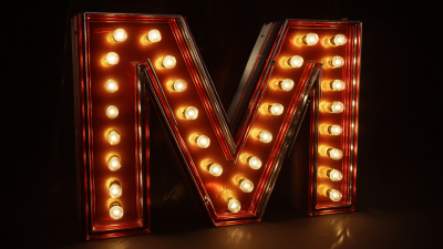
Techniques for Creating Eye-Catching 3D Letter Effects
Creating eye-catching 3D letter effects involves several techniques that enhance visual appeal. Start with a solid foundation. Choose the right typeface that aligns with your brand's identity. Bold, sans-serif fonts often translate well into 3D. Simplistic designs can be effective. They draw attention without overwhelming the viewer.
Lighting and shadows play a crucial role in 3D letter design. Experiment with various light sources to create depth and dimension. Highlights can give letters a polished look. Conversely, shadows can add drama and intrigue. Using gradients instead of flat colors can also amplify the visual impact. Don’t hesitate to mix styles. Sometimes, imperfections like uneven edges can lend character and authenticity.
Finally, remember to test your designs in different contexts. A striking 3D effect in one setting may not work elsewhere. Evaluate how it appears on various screens or materials. Seek feedback from peers or potential users. This insight can help refine your approach. It’s a balance between aesthetics and functional design that will ultimately reinforce your branding efforts.
3D Letter Effect Preferences by Design Professionals
Implementing 3D Lettering Across Different Media Formats
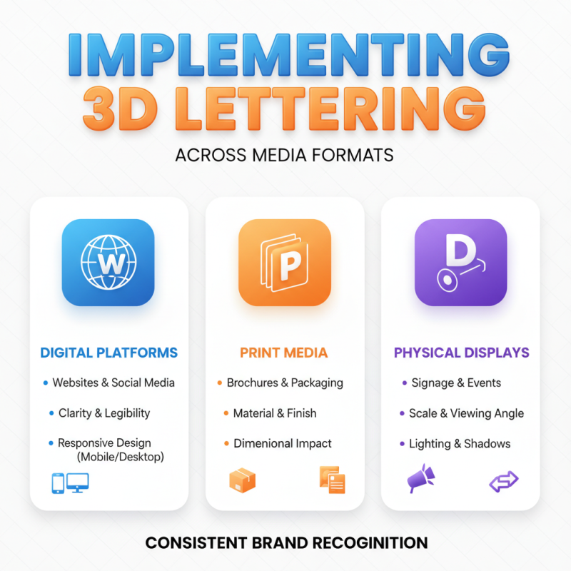
3D lettering offers a unique way to brand effectively. It can capture attention, especially in designs where depth plays a key role. When applying 3D lettering across different media formats, understanding how each platform renders these letters is crucial. For digital applications, like websites and social media, clarity is vital. Ensure the letters are legible and visually appealing on various devices. Test how they appear on mobile versus desktop. The goal is consistent recognition.
In print media, such as brochures or signage, the texture and materials come into play. Consider the surface where the lettering will be applied. Is it glossy or matte? Will it be embossed or flat? Each choice impacts the final appearance. 3D letters can look stunning, but they might lose clarity in certain lighting. Research the environments where your designs will be displayed.
Reflecting on your approach is essential. Not every experiment will yield praise. Sometimes, the hardest lessons come from designs that fell flat. Gather feedback throughout the design process. Adjustments may be necessary to ensure the 3D lettering resonates with your audience. The path to effective branding is often filled with trial and error. Keep learning from each iteration.
Evaluating the Impact of 3D Letters on Brand Recognition and Recall
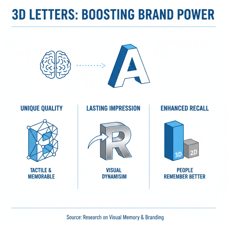
3D letters can significantly enhance brand recognition and recall. They offer a unique, tactile quality that traditional 2D designs often lack. Brands that utilize 3D lettering create a lasting impression. This visual dynamism can draw in customers and make a logo memorable. Research shows that people remember three-dimensional elements better.
The depth of 3D letters provides a sense of realism. This realism can enhance a brand’s identity and relatability. However, it’s important to consider the execution. Poorly designed 3D letters can confuse rather than impress. A lack of cohesion in style, color, or size may dilute the intended message. Brands might find that over-complicating their designs can lead to less recognition.
Evaluating the impact of 3D letters requires understanding their context. They must align with the overall branding strategy. Without this alignment, the risk of miscommunication rises. Effective design often involves trial and error. Brands should not shy away from refining their approach. Observing how consumers react can lead to valuable insights.